You are using an out of date browser. It may not display this or other websites correctly.
You should upgrade or use an alternative browser.
You should upgrade or use an alternative browser.
[RD] Daily Graphs and Charts
- Thread starter Winner
- Start date
- Status
- Not open for further replies.

Traitorfish
The Tighnahulish Kid
Interesting that the drop in support for overturning is greater than the rise in opposition. That just margin of error, do you think, or is there an expanding middle-ground?

On the tenth anniversary of the 2003 Canberra bushfires, a graphic of the progress of the fires:

This is the Australian Capital Territory and the surrounding area of New South Wales. Everything that isn't the defined yellow urban area of Canberra itself is basically bushland.
The colour coding is a bit off - obviously only the leading eastern edge was burning at any one point. And the fire did encroach into actual suburb, which isn't shown in this animation. About 500 homes were burned, 4 people killed.
In the spoiler is a larger and more detailed but not animated map:

for the record I live just below the 'N' in North Canberra.
This is the Australian Capital Territory and the surrounding area of New South Wales. Everything that isn't the defined yellow urban area of Canberra itself is basically bushland.
The colour coding is a bit off - obviously only the leading eastern edge was burning at any one point. And the fire did encroach into actual suburb, which isn't shown in this animation. About 500 homes were burned, 4 people killed.
In the spoiler is a larger and more detailed but not animated map:
Spoiler :
for the record I live just below the 'N' in North Canberra.
Monsterzuma
the sly one
- Joined
- Jun 1, 2008
- Messages
- 2,984

Monsterzuma
the sly one
- Joined
- Jun 1, 2008
- Messages
- 2,984

Murky
Deity

Integral
Can't you hear it?
Why do poor people experience little or no decline in their income when they age? Because they're already making minimum wage (or close to that)? Because a large part of their income is government transfers? Or just the particularities of their jobs?
Terxpahseyton
Nobody
- Joined
- Sep 9, 2006
- Messages
- 10,759
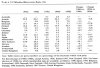
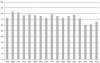
Voters in relation to party members

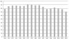
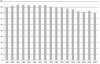
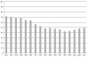
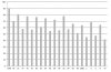
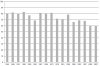
Voter turnouts for selected nations
Source: My political theory prof (I am not a political "scientist" )
)
Voter turnouts for selected nations
Spoiler :
Germany

Italy

Switzerland

UK

USA

France

Norway

Spoiler :
Italy
Spoiler :
Switzerland
Spoiler :
UK
Spoiler :
USA
Spoiler :
France
Spoiler :
Norway
Spoiler :
Source: My political theory prof (I am not a political "scientist"
)Attachments
-
 AnteilParteimitgliederAnWahlberechtigten.jpg91.6 KB · Views: 246
 -
 WahlbeteiligungD.jpg54.3 KB · Views: 301
 -
 WahlbeteiligungItalien.jpg56.4 KB · Views: 246
 -
 WahlbeteiligungSchweiz.jpg48.3 KB · Views: 237
 -
 WahlbeteiligungUK.jpg51.9 KB · Views: 247
 -
 WahlbeteiligungUSA.jpg54.3 KB · Views: 244
 -
 WahlbeteilungFrankreich.jpg52 KB · Views: 283
 -
 WahlbeteilungNorwegen.jpg124.2 KB · Views: 260
Mise
isle of lucy
It could also just be that the line is so small that you can't really see the variation in the line. Maybe if they were indexed to 100 it would be easier to compare the change.Why do poor people experience little or no decline in their income when they age? Because they're already making minimum wage (or close to that)? Because a large part of their income is government transfers? Or just the particularities of their jobs?
Although I should also point out that the people age 19 in the bottom decile aren't necessarily going to be in the bottom decile at age 75, so it's not really tracking their income over their lifetimes anyway...
Lord Chambers
Emperor
- Joined
- Nov 23, 2001
- Messages
- 1,004
Good point.Although I should also point out that the people age 19 in the bottom decile aren't necessarily going to be in the bottom decile at age 75, so it's not really tracking their income over their lifetimes anyway...
Tycho Brahe
Emperor
Legend:
Big red symbol: 10 million - 15 million
Purple symbol: 5,050 million - 10 million
Small blue symbol: 20,500 million - 5,0450 million
WHAT?!?!?! It doesn't make sense?!?!
But it has lots of cute little smokestacks and some arrows and stuff. So you get the idea anyway.Legend:
Big red symbol: 10 million - 15 million
Purple symbol: 5,050 million - 10 million
Small blue symbol: 20,500 million - 5,0450 million
WHAT?!?!?! It doesn't make sense?!?!
")
Legend:
WHAT?!?!?! It doesn't make sense?!?!
It says metric tons/year.
Integral
Can't you hear it?
Your basic model of the government should be that it's an insurance company with an army.


- Status
- Not open for further replies.
Similar threads
- Poll
- Replies
- 120
- Views
- 8K
- Replies
- 0
- Views
- 570