@mise: I don't think we are in substantial disagreement on anything, except on the issue of what is and isn't worth pointing out, which should be entirely a subjective matter.
Mise said:
TL;DR: Obviously you're not going to see a pattern between total private + public debt and government bond yields, because bond yields don't work like that.
Right, so you agree with me and my chart. Glad we're on the same side in this mythbusting exercise.
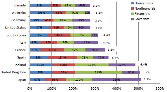
1) That's the current bond yield on government debt, not the average interest rate on all debt that the government holds. The original blog seems to think that the %s on the right are "the long term interest rates that those economies are funding the debt on", which is not the same as the current bond yield on government debt.
They are funding newly taken on long maturity debt at that rate. This does not contradict their formulation.
2) If they are using current government bond yields, then they are woefully out of date.
Woefully? Can the hyperbole. At best there's a few months lag. And even then the ratio between the rates hasn't changed much at all.
3) The maturity of those bonds is at least as important as the average interest rate that each government pays on them. E.g. the average maturity of UK bonds is something like 12 years, whereas a large chunk of Italian bonds are maturing within the next few months. That makes Italy's problems MUCH more serious than the UK's problems -- which has an impact on each country's cost of borrowing.
That is a valid explanation of part of the discrepancy, which is valuable to point out. You argue my graph was useless and here you are using it as platform for explaining the intricacies of debt. That's contradictory. As far as I'm concerned the graph is serving it's purpose.
4) That's the current bond yield on government debt. If you're only interested in government debt, then why include private debt (i.e. household + financials + nonfinancials) in the chart? And if you're interested in private debt, then how on Earth are you supposed to calculate the average interest rate paid on all private debt? Indeed, is the "average" even relevant?
To eliminate the possibility that private debt is a factor. We have seen governments bail out the private sector before so private sector balance sheets are hardly irrelevant to government finances. In as far as there is a lack of information on interest burdens, we can acknowledge the potential for variance in this regard and entertain divergences from the mean as a possible explanation. We can still examine the effect of the debt to GDP ratio on interest rates under the assumption that variations in both directions more or less cancel each other out and review the relevance of such an analysis in the context of the likelihood of the assumption being true.
As to why private debt is emphasized in this graph: the blog I linked to is written by a post-Keynesian endogenous money theorist, who tend to argue that any form of debt expansion creates purchasing power, such that when a debt contraction occurs there is a demand vacuum. Under these theories, private debt presents a very real burden on an economy and is relevant in any analysis of economic health and debt dynamics. As to why post-Keynesians are worth listening to, they did a better job than almost any other "school" predicting the 2008 crisis:
http://www.debtdeflation.com/blogs/2009/07/15/no-one-saw-this-coming-balderdash/
BTW, I don't see how putting more information into a graph can make it worse as long as it doesn't get cluttered. This hardly commits much of an offense in that regard.
Secondly, it's well known and well established that economic growth rates, central bank interest rates, and returns on other assets (e.g. stocks) drive government bond yields; the indebtedness of a government is important only to a point. Investors have a choice of what to invest in: they can invest in government bonds, corporate bonds, stock markets, or put the money into a bank (cash) and earn interest at a rate that broadly corresponds to the central bank's target rate. Thus, the return on corporate bonds, stock markets, or cash determine how much investors need to be compensated for buying government bonds. If investors expect the stock markets to return (risk adjusted) 10% this year, then government bonds will need to compete with that and offer higher yields. Similarly, if the banks are offering 10% interest on deposits (risk free), then investors would again need higher returns on government bonds before they buy them. So if an economy is crappy, which means low stock market returns, and if central bank interest rates are low, which means low interest rates on cash, then government bond yields will be low.
Alternative investments can be found in any country. Capital is very mobile in this regard. The thing that matter is competition between investment assets that offer returns in the same currency as the government debt, which ties in with my point that the risk free interest rate is a property of the currency, as are any interest rates derived from this rate. The expected and actual inflation rate of the currency, for example, influences nominal returns on investment (i.e. inflation premium). Japan's low interest rate is partly due to low inflation.
There is of course some extent to which carry trades straighten out difference in interest rate between currencies, but these don't level off the differences as readily in real time than they would in a perfectly efficient market.
A low government bond yield could be a sign of a crappy economy, because there really isn't anywhere else that investors can put their money. Or it could be a sign of a strong economy, because the government is a safe bet and can easily use its tax revenues to pay back its debts.
"crappy economy" is already accounted for by the GDP in debt-to-GDP. In this regard only expectations of future economic strength are a factor.
But if a government's bond yields are so low, then why wouldn't it borrow more money? It can easily afford to borrow more, because rates are so low. So a high level of government debt may be an indicator that the government is well financed (USA, Germany, Japan, UK). Or it could be an indicator that the government's has too much debt and can no longer service it (Greece, Italy).
This is actually an argument as to why the plain debt-to-GDP ratio is important. A government will decide to stop borrowing simply because the principal due of the debt is getting too high, such that the debt will become difficult to service when it is later refinanced at a potentially higher interest rate. This is why the fed is having such trouble getting people to borrow more right now even at 0% interest. The current price of credit is not the sole allocating factor in this context.
If you're trying to say that there is "no correlation" between interest rates on government debts and the level of government debt, then you have completely missed the point of what those things mean in practice.
Like I pointed out this is an empirical fact, and you've already declared you agree with it. All your argument amounts to is that there are factors other than the debt-to-GDP ratio, which has exactly been my point.
Everybody knows that you can't just look at total debt and assume that a bigger number means a bigger interest rate.
Really? There's still a bunch of people over at MSNBC, Fox News, CNN and a plethora of other national news networks that obsess over debt-to-GDP ratios. Maybe you should break the news to them.
And I'm not sure why this is "your" graph -- did you put it together?
Do you get a kick out of being anal for the sake of it?

Why can't you just accept that it has fatal shortcomings and learn from that, instead of "defending" it?
I stand by the claim that none of the "shortcomings" you point at invalidate the simple illustration that debt-to-GDP ratios, private or public, don't correlate much with current interest charges on government debt, a claim that you bewilderingly enough say you agree with. The relevance of the graph consists in how, much to both our irritation, a lot of people still imply that debt-to-GDP is the holy grail of solvency estimation.
Don't know why you seem to be personally offended here...
That's about as imaginative an interpretation of my words as it is wrong. I've been perfectly Zen writing all of this.

")