[RD] Daily Graphs and Charts

Status
Not open for further replies.
It's about how people who say inequality is globally on the rise are wrong. And how stagnating incomes are only a real problem for a relatively small group of already rich people. Feel free to engage this point.

I wouldn't make such strong statements from only one graph that just looks at only one facet of wealth, income, and power disparities (i.e. real income growth).

Anyway, too long without a chart or graph now.
 
A cool graph about how much each income group gained in real income between 1988-2008.


I think it shines a light on why a lot of people like to claim that income distribution is getting worse, when in fact it has been getting better at the global scale.

How come there are 2 datapoints above 100%?

The other potentially misleading thing about this that the X axis is by population, and the Y axis by percent. This does not make it clear that the bottom 44% of this graph represents the same amount of money as the top 0.0000235% so if you where to plot this by percent of the worlds wealth instead of the percent of the worlds population it would look very different.
 
How come there are 2 datapoints above 100%?
My guess is that they just spread it out because those two last data points would be too close to see if plotted on their correct location. They might be for instance the 99% and the 99.9% percentiles. So it's just to make visualization easier.

The other potentially misleading thing about this that the X axis is by population, and the Y axis by percent. This does not make it clear that the bottom 44% of this graph represents the same amount of money as the top 0.0000235% so if you where to plot this by percent of the worlds wealth instead of the percent of the worlds population it would look very different.

Not sure if you understood the chart. It's about growth in real income, not at all about wealth.
 
My guess is that they just spread it out because those two last data points would be too close to see if plotted on their correct location. They might be for instance the 99% and the 99.9% percentiles. So it's just to make visualization easier.

It makes the graph obviously incorrect, which makes me doubt it. You could be correct, and they have a good reason though.

Not sure if you understood the chart. It's about growth in real income, not at all about wealth.

I think I do. They plot growth in real income by percentage of population with that wealth, I am saying you would get a very different graph if you plotted growth in real income by percentage of wealth in the hands of that population. I think you may get a better idea of why people are upset from this graph. If you were to give the source data for this graph it should be pretty easy to produce, though I am not promising to do so.
 
Ultimately, the OWS people were entirely in the right. Though as they were a disparate group which grew organically and had no real cohesiveness to it, they didn't have the ability to really articulate the why of why they were right.

First, it's disingenuous at best to claim that OWS was about world inequality. That was only one aspect, and they were primarily talking about growing US inequality. It is undeniable that US inequality was in fact growing, and it is true that much of the reason for that is that the 1%, and less, was simply able to capture more of the national income, despite doing less work to earn it. That is, the income to capital has increased, while the income to work has not. And this in a time period where work is doing more work and capital is doing less work. Capital is simply able to capture more of the produced surplus. And, in doping so, it means that the world and nation has less wealth than it would have otherwise!

That is, it's disingenuous at best to say that the rising inequality is not bad globally, because many in the poorest nations have seen great wage growth. Because it's obvious that the inequality not grown so severely, the wage growth of the poorest would have grown even more. The growth in inequality reduces the rate of the growth of all wealth creation everywhere in total.

Because there is simply less total wealth in the system, there is less wealth that any of the income groups could possible earn.

You can't distribute until you create. Too much inequality destroys creation.

And the cause of growing inequality has been policies which have been deliberately enacted to redistribute wealth to the rich, and to freeze the middle (American poor and middle, global middle, and portions of the poor) out of the opportunity to have growing income.
 
It makes the graph obviously incorrect, which makes me doubt it. You could be correct, and they have a good reason though.
As Hygro noted (thanks Hygro) there actually aren't any data points beyond 100%, that's just an impression given by the line. So disregard my previous hypothesis. No mistake here.

I think I do. They plot growth in real income by percentage of population with that wealth, I am saying you would get a very different graph if you plotted growth in real income by percentage of wealth in the hands of that population. I think you may get a better idea of why people are upset from this graph. If you were to give the source data for this graph it should be pretty easy to produce, though I am not promising to do so.
I have no idea what you're suggesting.
My point is that the people who are upset are a rich and relatively small group. The bulk of the human population is not upset about current trends in income growth.

Ultimately, the OWS people were entirely in the right. Though as they were a disparate group which grew organically and had no real cohesiveness to it, they didn't have the ability to really articulate the why of why they were right.

First, it's disingenuous at best to claim that OWS was about world inequality. That was only one aspect, and they were primarily talking about growing US inequality. It is undeniable that US inequality was in fact growing, and it is true that much of the reason for that is that the 1%, and less, was simply able to capture more of the national income, despite doing less work to earn it. That is, the income to capital has increased, while the income to work has not. And this in a time period where work is doing more work and capital is doing less work. Capital is simply able to capture more of the produced surplus. And, in doping so, it means that the world and nation has less wealth than it would have otherwise!

That is, it's disingenuous at best to say that the rising inequality is not bad globally, because many in the poorest nations have seen great wage growth. Because it's obvious that the inequality not grown so severely, the wage growth of the poorest would have grown even more. The growth in inequality reduces the rate of the growth of all wealth creation everywhere in total.

Because there is simply less total wealth in the system, there is less wealth that any of the income groups could possible earn.

You can't distribute until you create. Too much inequality destroys creation.

And the cause of growing inequality has been policies which have been deliberately enacted to redistribute wealth to the rich, and to freeze the middle (American poor and middle, global middle, and portions of the poor) out of the opportunity to have growing income.

The point Noah Smith (who is a mainstream left-wing economist) was making in the article where I got the graph from is pretty different. He was suggesting, based on theories of economic geography, that the growth in already mature regions tends to slow down temporarily while new regions are going through a rapid industrialization, due to a shift of global resources and re-arrangement of productive chains. But growth should go back to normal after the rapid industrialization phase gives way to a more consumption-based development in the new region. That would explain the low growth in income for much of the American population, which saw a lot of their traditional jobs outsourced. Why did the super-rich continue to do well? Presumably because they're in a position to profit from the expansion of the emerging regions as well, and didn't depend on the jobs that faced foreign competition.

So you talk about policies that deliberately diverted money to the 1%, but I don't see it that way. I don't see why anyone would pay an American worker 10 times more than a Chinese one to make one steel plate. The stagnation of wages for a large section of the US population during the last couple decades may have been unavoidable, but there's no reason to suppose it's eternal. As China becomes a proper industrialized nation and refocus its growth on consumption, it will become a more expensive country and the US will "re-industrialize" to a degree. Which is already happening. Or so the theory goes anyway.

But the key point here is that on a global scale what happened was not bad, it was really really good. It meant previously dirt poor people, on the edge of starvation, now enjoy a decent living standard. And we're talking of hundreds of millions of people here. So the world got more equal. The Gini Index of the whole Earth has been steadily falling since the mid 1980's. So there's no rise in global income inequality.


Over half of the US population thinks the miliary targeting and killing civilians is sometimes justified.
 
Probably have to ask Gallup or the poll respondents
 
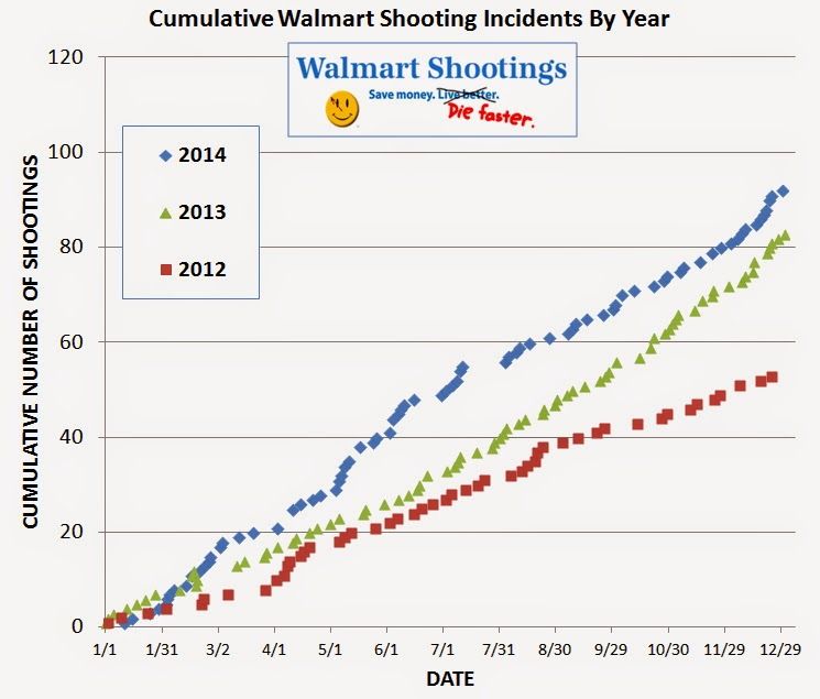
those walmart slogans look like something from They Live
 
With blood on the happy-face? Definitely.
 
So you talk about policies that deliberately diverted money to the 1%, but I don't see it that way. I don't see why anyone would pay an American worker 10 times more than a Chinese one to make one steel plate.
Does it means the American consumer can pay products 10 times less than what it used to be?
The criticism is that all the gain from outsourcing jobs disproportionally profited that 1% without being reasonable spread across all society.

American workers got stagnating wages, loss of jobs, and loss of negotiating power with corporations without getting that much in return.
Corporations instead reaped all profits on top of it.
 
I find it really hard to believe the US isn't among the highest per capita consumers.
 
I find it really hard to believe the US isn't among the highest per capita consumers.
Wiki page , has US on 25th place with just 4,2 kg per capita.
Maybe because those Starbucks drinks reportedly have negligible amount of coffee? :p
Still, wiki data is from 2008 or older.
 
Status
Not open for further replies.
Top Bottom