[RD] Daily Graphs and Charts

Status
Not open for further replies.
Uh. 2100. Bangladesh. Asia. Some 86 years distance.

Allowing for correct and carefully made calculations, of course.
 
I also think it is an exaggeration and it is not probable that a tenfold increase will take place there.

But anyway, Bangladesh is already one of the most overpopulated places and its population size continues to grow.

In 1901 population of Bangladesh was 28,928,000 and nowadays 152,518,000 (over 5 times more), despite considerable emigration.
 
Hmm. I think if based on that, the UK will still be whiter than the US, though I suppose that's not too surprising to begin with.
 
30% Mixed + 40% White would still look and feel pretty "White British" IMO. I mean by necessity those Mixed race kids will mostly be 2nd generation.
 
30% Mixed + 40% White would still look and feel pretty "White British" IMO. I mean by necessity those Mixed race kids will mostly be 2nd generation.

One could also expect that the standards for what is percieved as "white" would shift.
I.e. Some person who'd today be identified as "asian" by most random strangers in the streets might then maybe be identified as "mixed" by a majority of passers-by per chance, someone who'd today count as "mixed" may on occassion be percieved as "white".

That's a good point. We can already see this phenomena today and in the past when comparing how different cultures think of whiteness. For instance, say, in Latin America the definition of whiteness might seem looser to someone from the USA, since Latin America has had a much longer and open history of 'mixing' compared to the USA.
 
It is quite likely that the categories we use to identify people will change; This graph 900 years ago might have listed percentages of angle, saxon, norman and mixed.
 
Domen said:
But how many of these 30% Mixed will be white + non-white? Because some of them will be non-white + non-white for sure.
You can just look at the results of the projections, you know. I just had a quick look and by 2026, 70% of the Mixed group will be white + non-white while only 30% will be something like non-white + non-white. By 2050, the number is up to 72%. They don't report after 2050 on the composition of the Mixed groups. But I think it highly likely that the share of Mixed people who identify as being at least part-white will increase. Why? (1) Because the largest number of marriage partners are white and (2) because the largest share of Mixed people to begin with were white and non-white. That means that other races are far more likely to marry whites and product Mixed children who are white, and it also means that Mixed adults are rather more likely to transmit (given how the model works) their white identification.

dutchfire said:
It is quite likely that the categories we use to identify people will change; This graph 900 years ago might have listed percentages of angle, saxon, norman and mixed.
I think it extremely likely that the conception of what a white Briton is will change rather radically and has changed rather radically. It used to be that even a hint of brown blood made you ineligible, now it's rather more flexible than that.
 
Spoiler :
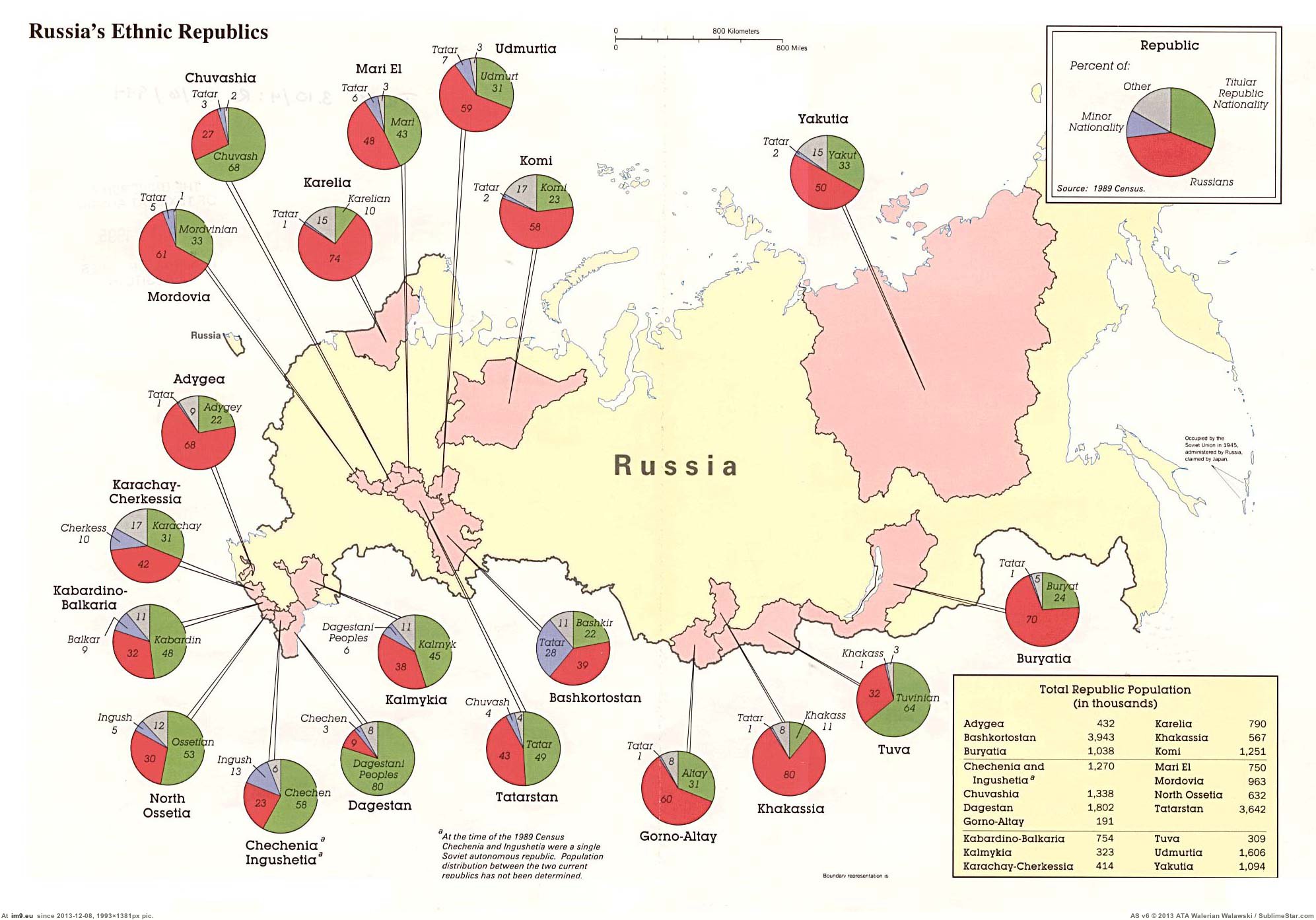
mapporn-ethnic-proportions-in-russian-federation-s-autonomous-republics-based-on-1989-census-1-993px-1-381px.jpg

====================================

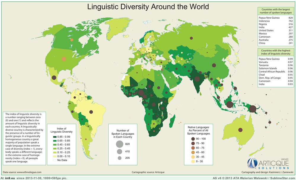
Linguistic diversity around the world:

mapporn-linguistic-diversity-around-the-world-800x600.jpg


====================================

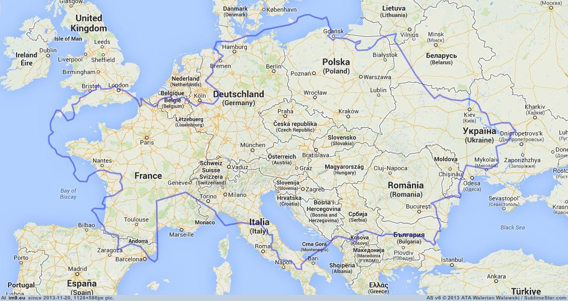
Kazakhstan compared to Europe (Borat wins this round):

mapporn-kazakhstan-compared-to-europe-1128x586.jpg


====================================

Map of the Partitions:

Spoiler :
LuxembourgPartitionsMap_english.png
[/url]
 
http://redalert.co.il/

Not quite a graph, but it gives visual information about all the rockets fired from Gaza into Israel and even those that hit into th West Bank. They don't show those rockets and mortars that don' land in Gaaza.
 
very nice!
I wonder what it means the different size of the circles?

<snipped map>
I wonder how more misinforming they can make the map be.
 
Status
Not open for further replies.
Back
Top Bottom