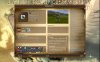
[FfH II Art Team Blog]

I worked long and hard on this stuff and I wanna get as much feedback from you guys as possible.

I think it looks gorgeous. I note that the money silder (and the drama slider) in the upper left are not fully contained in the background banner? I guess they should contained as this banner looks like it is intended to encapsulate these items and would look great doing so, though it would enlarge the banner and use up more precious space. If I'm not mistaken, there used to be no banner and I am always missing those tiny slider buttons and selecting the unit behind by mistake, so, for this small area, I like have the banner obscure the units behind it.

I agree that the unit health bars are not visible. Certainly for the first three leftmost units. It looks like these units should just be brought to the top layer, as the promotions appear to be.

I like how the information screens are now transparent, that really does help open the usable playing area. It would be nice if unit could be selected while under the transparency as it is a bit of a hassle seeing the unit but not being able to select them. I also noted that the mouse over of units/terrain within the transparncey worked sometimes and not others.

I like removing the next turn button and making the Armageddon Counter dual purpose for this. Again, just that bit more space we like.

Small alignment issue I have with the upper right most buttons. The width of the background banner is great but the vertical alignment seems off. The banner has two tones, it seems like the bottom row of buttons (below the time/turn counter) should be vertically centered in the bottom tone of the banner yet it is currently vertically aligned to the top (of the bottom tone).

Just some minor notes you may have already know about but I really like the feel and function of this new interface. Great job.
 
Possible to move the units up a few pixels and if still can't see the health bars clearly, maybe enlarge the buttons a wee bit to uncover them?

minor notes: Research screen, one that describes new tech to you does not have same border around it that other windows have and the continue button on it does not highlight with same golden border other buttons highlight with. Most of the Advisor windows are also lacking the edge border. Somnium screen looks great, this is how I feel the advisor screens should look.
 
While talking about the HUD, is someone thinking in brining the PLE buttons back? Was it converted to BtS?
 
seZereth, your HUD looks absolutely great!
I'm already very much looking forward to see it included in the main mod. :)
 
seZereth, your HUD looks absolutely great!
I'm already very much looking forward to see it included in the main mod. :)

there will be a lot more tweaking until it goes in officially ;)
 
I loved and admired the Malakim mage a lot: IMO he was perfect with the yellow flames behind, his wide cape (manteau) - so beautiful!

Being a huge fan of your fine designs and art, I really regret to tell you, that the new mage is by far not so fine as the old one. Considered a relaunch? Please ...
 
[NWO]_Valis;7188178 said:
While talking about the HUD, is someone thinking in brining the PLE buttons back? Was it converted to BtS?

The BUG mod has updated PLE. I think you could disable any other features you don't want.

We tried to use the BUG Mod PLE in Fall Further. It does not play nicely with FfH at all, so we need to write our own version from scratch. It's one of many items on my lengthy "to-do" list, so might be a while till I get around to writing it.

I'll check to see if there is any way to re-define the Health Bars to use a different progress bar type, or to omit the foreground of the progress bar. It is just the edging effects of the bars which cause them to show pure gold instead of any filling (even on the left 3 you ARE seeing the health bars, they just blend in really well)

And yes, all bars still fill with the same colors right now (green research, gold GPP, brown food and... blue? Production)
 
Aren't the Somnium and Scenario Buttons a bit too dark against that background?

Otherwise, the HUD looks good :)
 
As far as progress bars go, I’m also not sure I love the edging for the food and production progress bars in the city screen. The bars are very bright compared to the filler colors and it makes it difficult to see the bar.

Another small criticism: I feel like the adviser/Somnium/Scenario buttons look “dirty” somehow. There is a ring of black pixels or something around each of the buttons and it makes them look odd and unfinished.
 
xienwolf pointed me to the civilopedia screen, so I modified it a bit:

attachment.php
 

Attachments

  • Civ4ScreenShot0093.JPG
    Civ4ScreenShot0093.JPG
    177 KB · Views: 1,085
seZ, could you please upload the grassy hill backdrop .dds from the civlopaedia screen? It looks awesome! :D

@ Xienwolf - Maybe you could try copying the TreeCut node from the Forest Preseve improvement to another nif? Refar's probably already tried it though, but if nobody's tried it then it's definitely worth a shot.

yea, I´ll post it into the graphics modpacks thread
 
This includes the most recent version of everything (including pedia, terrain, icons, etc and such). I beg you to use all the files to replace the ones I already sent you, as I am not sure which one were already up to date.

I would like you guys to play with it and tell me if it improves the overall feeling or if something is missing / wrong or e.g. if it has some serious performance issues

again, 2 downloads, just to make sure ;)

http://rapidshare.com/files/142293185/HUD_sezereth_edition_V.zip.html

http://www.fileshack.us/get_file.php?id=843829&file=HUD+sezereth+edition+V.zip

The files inside the HUD folder go into your main FfH folder and replace everything (if there is no "do you want to replace..." popup, then you did choose the wrong folder...).

I m into unit creation again.
 
[to_xp]Gekko;7206455 said:
that is not compatible with FF right? I'd love to try it out if it is :)

btw, does it still make it difficult to see units' health bars?

not yet, but if someone tests it and sees it looks fine, then maybe vehem can be convinced to include it earlier than FFH will ;) (scheduled for 0.34 i think).

A, yea, I forgot.
I could not solve the Health bar issue, so, I hope xienwolf will find a solution at some point (I personally dont mind not seeing it, but I think it is fixable with some code, but not by me)
 
Back
Top Bottom