Altered Maps XVIII: Continuing Curious Cartography

if you are not from "the superior race/country/culture or whatever" you end up deeply suspicious . After letting thousands of the finest soldiers of Ukraine suffer in an area that invited them to be cut off , the Polish authorities are now telling the American military aid is flowing normally . You know , Krasnov , Russian pr_stitutes , secret recordings , craziness , mercantilist economic theory 250 years late , treason , getting out of NATO , invading Greenland . Russia as an antithesis is essential to human survival . And ı say this , despite the challenge about giving hopes and stuff about the pipedream of a Caliphate two posts up .
 
Moderator Action: This is not a political discussion thread...
 
1742306495734.png


and an explanation
 
Or, can just be like my city and not have any municipal government or boundaries at all.

But yeah, this regularly catches people off guard when they try to compare cities in the US. People will do things like cite San Fransisco's 800k people or Chicago's 3 million like those figures mean anything abut actual city size, and get confused thinking it means Sydney (5 million) is larger than LA (4 million). And completely miss some of the largest ten US cities like Miami or Washington DC because they're especially municipally fragmented.

When in reality if Australians counted city size the way the US does, by just focusing on municipal boundaries, Brisbane is the biggest city in the country followed by Gold Coast and Moreton Bay on either side of it, while Sydney isn't even the biggest city in Sydney.
 
Last edited:
1742410616373.png


It's a t-shirt.
Eh... not a very good idea, but at least it shows which countries matter or something.
The white in Iberia is strange - of course no New Zealand but that is common.
 
You can see the point where Galway City Council's responsibility ends and Galway County Council's responsibility starts on a particular road during the summer.
The city mows the grass verges up to the boundary, the county doesn't.
 
1744122415096.png

Iconium being capital of new new Turkey is actually realistic in this timeline, as it was the first capital of a turkic state in Anatolia.
Not sure about Spain, with the capital at Lisbon.
 
d41586-025-01213-w_50859522.jpg
 
But blue harder, so . . . it's a win.

They should show in purple states that have at least some citizens who voted each way, and then present those purple states as the real losers in all of this.

We wouldn't want, you know, health!
 
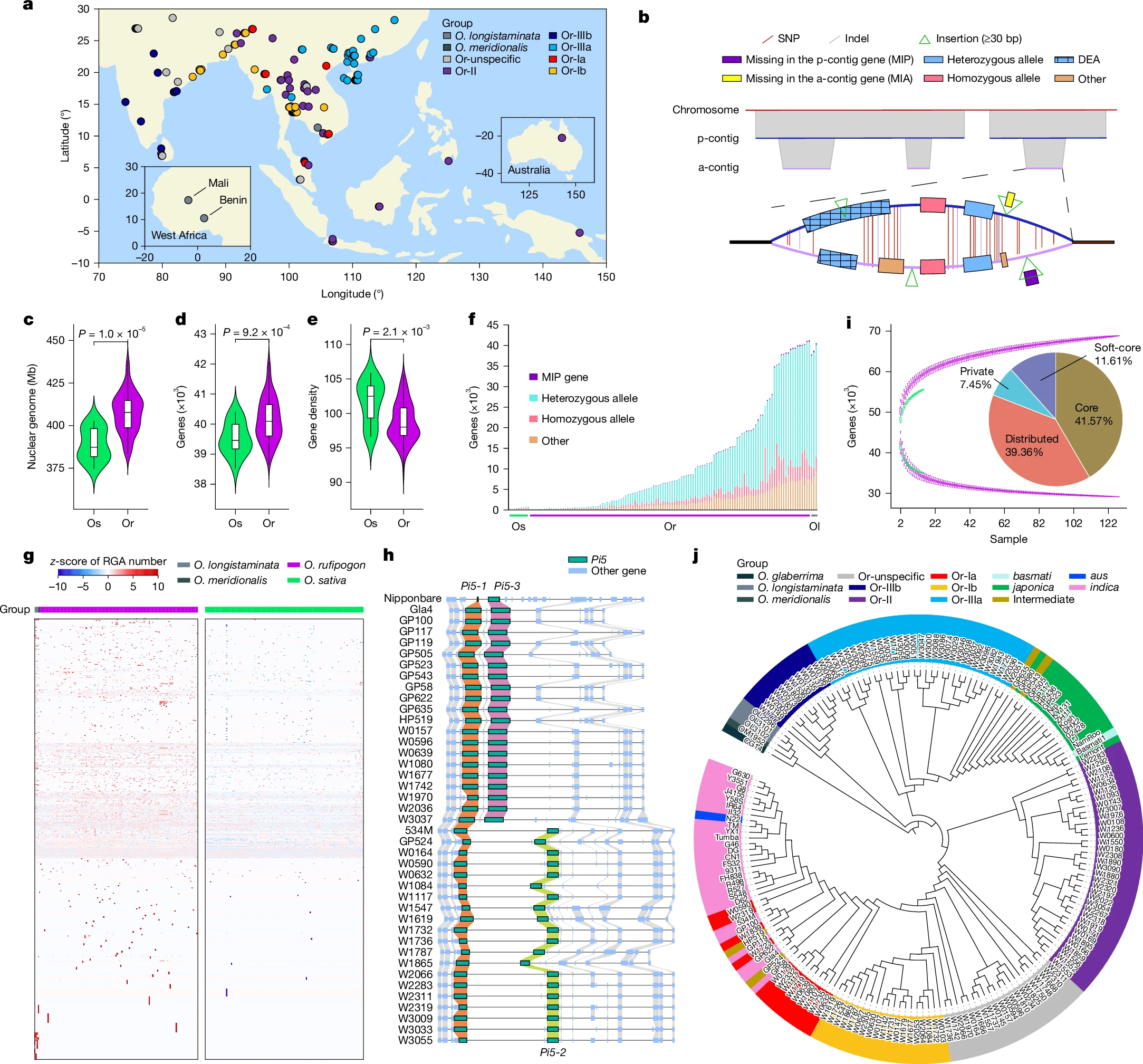
Where does rice come from?

U8MPs9z.png


Spoiler Full Image :

41586_2025_8883_Fig1_HTML.png

Spoiler Legend :
a, Geographical distribution of 133 wild rice accessions, with dots coloured by group. Inset maps show enlarged views of West Africa and Australia. Positive values indicate east longitude (°E) and north latitude (°N). b, Schematic representation of p-contigs and a-contigs, showing gene models and variant information from HiFi genome assemblies. c–e, Violin plots comparing O. sativa (Os; n = 16) and O. rufipogon (Or; n = 129) varieties for nuclear genome size (c), gene number (d) and gene density (gene number per Mb) (e). The box edges mark the 25% and 75% quartiles and the central line marks the median. Whiskers extend to 1.5 times the interquartile range (IQR). Statistical significance was determined by two-sided Wilcoxon test; P values are shown at the top. f, Distribution of genes on a-contigs across 133 HiFi genomes, including O. longistaminata (Ol). g, Heat map showing RGA loci that have a higher average copy number in wild rice than in cultivated rice, normalized using a row-wise z-score method. Each row indicates an RGA locus, and each column indicates a variety. h, Local synteny plot of Pi5 loci (chr. 9: 9.65–9.79 Mb in the Nipponbare reference genome) from 41 accessions. Pi5 genes (Pi5-1, Pi5-2 and Pi5-3) are shown in green with collinearity represented by lines of different colours; adjacent genes are shown in blue with grey collinearity lines. i, Accumulation curve of the number of pan-genes (uptrend lines) and core genes (downtrend lines) across O. sativa (green; n = 16) and O. rufipogon (purple; n = 129) varieties. The pie chart shows the gene proportions in the combined wild–cultivated pangenome (n = 145). j, Phylogenetic tree of the 180 Oryza varieties, on the basis of single-copy genes. Diverse groups are denoted by colour-coded labels.

 
Back
Top Bottom