You are using an out of date browser. It may not display this or other websites correctly.
You should upgrade or use an alternative browser.
You should upgrade or use an alternative browser.
[RD] Daily Graphs and Charts II: Another 10,000 to come.
- Thread starter Cutlass
- Start date
stfoskey12
Emperor of Foskania
Here's a map I made showing the population change of US states from 1920-2020. You can see that places in the West and Southeast tended to grow the fastest.

GinandTonic
Saphire w/ Schweps + Lime
- Joined
- May 25, 2005
- Messages
- 8,898
Oil

Graphical representation of the global biomass distribution by taxa. (A) Absolute biomasses of different taxa are represented using a Voronoi diagram, with the area of each cell being proportional to that taxa global biomass. (B) Absolute biomass of different animal taxa. Gt C = gigatons of carbon.
Farm Boy
I hope you dance
- Joined
- Sep 8, 2010
- Messages
- 28,269
It's climate control, I think.
Graphical representation of the global biomass distribution by taxa. (A) Absolute biomasses of different taxa are represented using a Voronoi diagram, with the area of each cell being proportional to that taxa global biomass. (B) Absolute biomass of different animal taxa. Gt C = gigatons of carbon.
Given how little individual arthropods and viruses weigh, the fact that as a whole they outmass all of humanity by 16 times or three times is quite staggering.
It was the viruses that really surprised me. I bet that is dominated by bacteriophages. They also had where they lived, and I was surprised so little was in the seaGiven how little individual arthropods and viruses weigh, the fact that as a whole they outmass all of humanity by 16 times or three times is quite staggering.

Yes, the viruses must be dominated by bacteriophages. The total amount is rather little, but only because the whole phage is just very little.
The low amount of marine biomass also surprises me, but yeah... there aren't that many water plants, if you think about it.
The low amount of marine biomass also surprises me, but yeah... there aren't that many water plants, if you think about it.
There is phytoplankton, that are pretty much the basis of the marine food chain. My guess is that without the massive trunks of trees they have quite short but energetic lives.there aren't that many water plants, if you think about it.
Hence C in the second graph, showing that the marine biomass is dominated by the things that eat other things.
https://www.nature.com/articles/d41586-021-01966-0
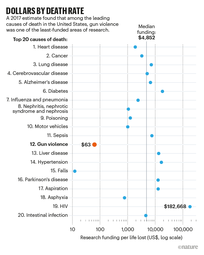
While this research is probably easier than a part of the others, it definitely seems underfundend.
The result has been an anaemic level of funding for research on one of the top 20 causes of mortality in the United States. One 2017 estimate2 says that gun-violence research is funded at about $63 per life lost, making it the second-most-neglected major cause of death, after falls (see ‘Dollars by death rate’).
While this research is probably easier than a part of the others, it definitely seems underfundend.
I am kind of surprised that falls is so low. Many people I have known have gone after they "had a fall". In this day and age of wearable electronics and IoT there must be a lot we can do, from monitoring progressive motor decline through catching near misses and reporting to home help to address the cause to automatic calling emergency services after a fall.https://www.nature.com/articles/d41586-021-01966-0
While this research is probably easier than a part of the others, it definitely seems underfundend.
[Goes off to think of grant proposal...]
Well... the topic itself doesn't seem to be too... complicated, let's say.
You have some good ideas there, but I doubt that you can fund a 100 different studies who are looking at this topic in interesting ways .
.
You have some good ideas there, but I doubt that you can fund a 100 different studies who are looking at this topic in interesting ways
.I do not know. Can you really fund 100 times as many studies on the impact of motor vehicles on the human body that you can falls? I suspect it is more about who dies from falls compared to motor vehicles than any particular difficulty or obviousness of the field of study.Well... the topic itself doesn't seem to be too... complicated, let's say.
You have some good ideas there, but I doubt that you can fund a 100 different studies who are looking at this topic in interesting ways

Source: https://www.core-econ.org/the-economy/book/text/05.html#figure-5-15d (which itself got the numbers from Our World In Data)
Last edited:
Might you have meant this link?
Source: https://www.core-econ.org/the-economy/book/text/50-02-glossary.html#glossary-reservation-option (which itself got the numbers from Our World In Data)
However I cannot find those terms defined there. I found this:
Market income inequality (before transfers and taxes)
Gross income inequality (after transfers and before taxes)
Disposable income inequality (after transfers and taxes)
Gross income inequality (after transfers and before taxes)
Disposable income inequality (after transfers and taxes)
I cannot see how it would make sense to plot disposable gini as additive with market gini. Is it saying that say in China market gini is nearly zero, or nearly equal to disposable gini, or that the total gini can be split into market and disposable components? Surely the function to turn a value into a gini index means you cannot do those sort of things like you could with a single value?
Spoiler Rant :
In the PDF above the image legends are text, but the OECD has made the text of their documents images, to make it harder for people to quote it. What part of their mandate is that working towards?
I had already corrected the link before you replied.
Market Gini: how unequal incomes are before taxes and transfers.
Disposable Gini: how unequal incomes are after taxes and transfers.
If they're nearly the same the implication is that taxes and transfers aren't very redistributive.
Market Gini: how unequal incomes are before taxes and transfers.
Disposable Gini: how unequal incomes are after taxes and transfers.
If they're nearly the same the implication is that taxes and transfers aren't very redistributive.
Last edited:
Paul in Saudi
Emperor
Honestly, I am not sure exactly what this map is showing. The red counties are the leaders in our next wave of covid. Is it showing cases per acre? Deaths per fortnight? I have no idea.
Similar threads
- Replies
- 4
- Views
- 240
- Replies
- 128
- Views
- 13K
- Replies
- 278
- Views
- 15K