https://www.nature.com/articles/d41586-021-01966-0
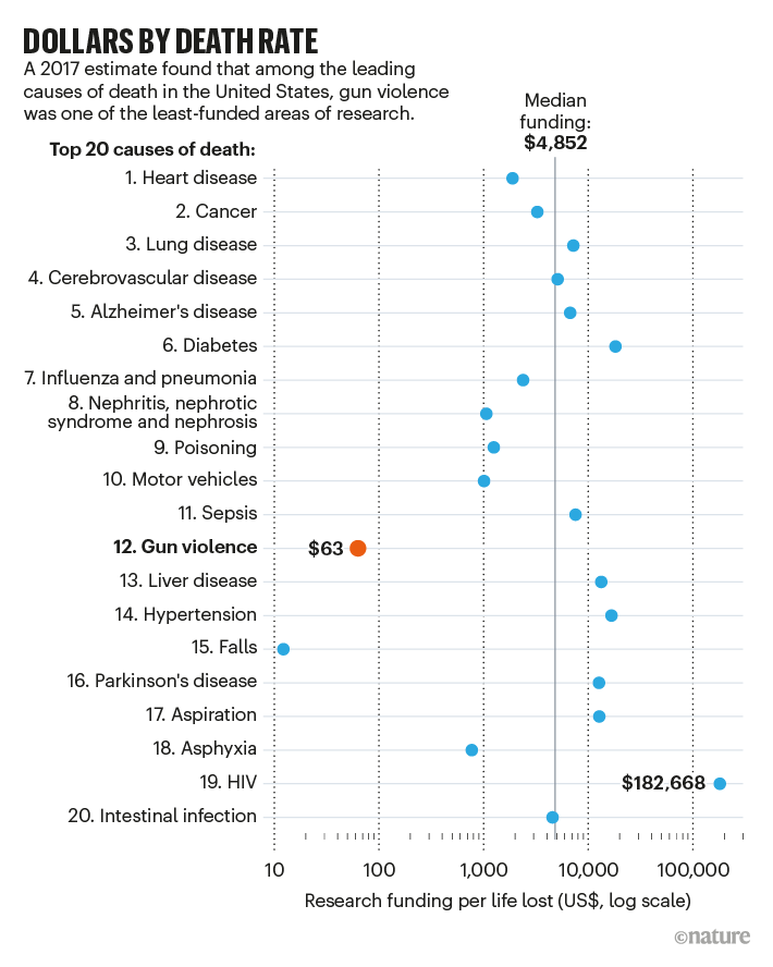
While this research is probably easier than a part of the others, it definitely seems underfundend.
Surely one day they can find a cure for gun
https://www.nature.com/articles/d41586-021-01966-0
While this research is probably easier than a part of the others, it definitely seems underfundend.
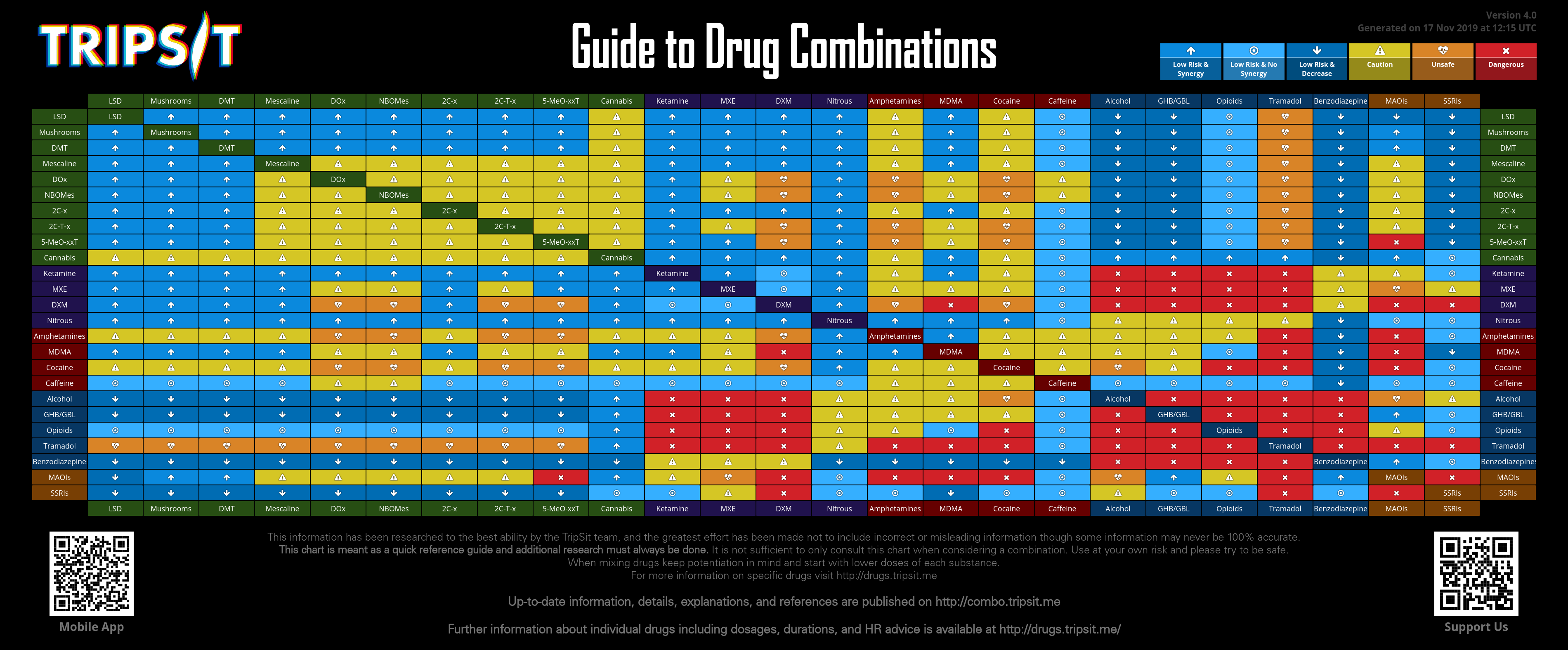
Might you have meant this link?
However I cannot find those terms defined there. I found this:
Market income inequality (before transfers and taxes)
Gross income inequality (after transfers and before taxes)
Disposable income inequality (after transfers and taxes)
I cannot see how it would make sense to plot disposable gini as additive with market gini. Is it saying that say in China market gini is nearly zero, or nearly equal to disposable gini, or that the total gini can be split into market and disposable components? Surely the function to turn a value into a gini index means you cannot do those sort of things like you could with a single value?
Spoiler Rant :In the PDF above the image legends are text, but the OECD has made the text of their documents images, to make it harder for people to quote it. What part of their mandate is that working towards?
One day... A gun vaccine maybe.Surely one day they can find a cure for gun
Data from one year later and it doesn't seem the USA has improved the balance.

") )
)What's the measure? Is it goods or goods and services?

I feel there is something missing here.
Source: https://twitter.com/johnrobb/status/1416834199097643013?s=20 (no idea, if accurate or what the data actually is
PS: But yeah, in truth, the maps don't really tell us anything, the graph is more interesting and the data is more complicated. And one probably should throw in regional powers as well like South Africa or Brazil and maybe even Russia. India of course deserves a spot on its own regardless, and then you can just do "biggest trading partner per country" and now I have to look that map up
PPS: Wikipedia has a good map for that, split between exports and imports, quite interesting to look at: https://en.wikipedia.org/wiki/List_of_countries_by_leading_trade_partners


Here is a neat one. I wonder if this link will generate a preview.
https://streets.mn/2016/07/07/chart-of-the-day-vehicle-weight-vs-road-damage-levels/
Nope.
 .
.Basically why you need road-pricing (that takes into account vehicle weight).Here is a neat one. I wonder if this link will generate a preview.
https://streets.mn/2016/07/07/chart-of-the-day-vehicle-weight-vs-road-damage-levels/
Nope.
I do not think road damage is the biggest externality of car use.Basically why you need road-pricing (that takes into account vehicle weight).
I do not think road damage is the biggest externality of car use.