[RD] Daily Graphs and Charts II: Another 10,000 to come.

Last year I read a book about the hyperinflation in Germany following the First World War. Prices were going up so fast, men would take their pay in cash, hand half of it to their wives and split up: One would sprint to the grocery to buy the week's food and the other would run to the utilities office to pay the electric bill in person. I guess at some point, money became useless and people just started bartering. But an economy without viable currency can't accommodate anything that isn't a consumable commodity or an immediate service. Banking stops, construction stops, transportation stops, government services stop. Whole economic sectors shut down. I suppose farmers could at least feed themselves, until they started to run out of seed and fertilizer and fuel for their tractors. Eventually, you could sell your furniture to buy a loaf of bread, but maybe burning it for heat was a better use for it.
I've read a couple of books set in similar circumstances and there is always some character that takes their giant stack of nearly worthless bills to the bank and pays off their mortgage on the spot. I wonder how often that actually happens or if banks build in some sort of agreement that they can adjust your balance with inflation or something?
 
Contracts will build in that language once they learn that a government might erode away loans. Over time, it becomes industry-practice. But the language appears after people learn about the threat, not so much before. That's kinda like most finance.
 
I've read a couple of books set in similar circumstances and there is always some character that takes their giant stack of nearly worthless bills to the bank and pays off their mortgage on the spot. I wonder how often that actually happens or if banks build in some sort of agreement that they can adjust your balance with inflation or something?


That depends on the regularity of the inflation. Anything which is ongoing at more or less the same rate for years at a time will be priced in. Anything which just happens out of the blue screws up the system. Badly.
 
Made a graph comparing total factor productivity (which professes to measure technological change) to the year 10 years before. (data source: https://www.rug.nl/ggdc/productivity/pwt/?lang=en )

AyYJK09.png


Does anyone know how I might be able to convice Excel to put the year axis at the bottom of the chart?
 
Last edited:
For the "other". Eretria is football. Latvia is Hockey - when did Ice Hockey become default Hockey? Is this an Americanism? Is it that while far fewer people play Ice Hockey they care about it far more than regular Hockey players?

Only Mongolia is holding out against globalisation with their love of Mongolian wrestling.
 
football is definately the most popular sport in norway, both now and 2006

tells me their algorithm or whatever is pretty bogus
 
Bit dark:
INTERACTIVE-Chemical-weapon-atttacks-Syria.gif

Spoiler Similarly cheery :
INTERACTIVE-Chemical-weapon-attacks.png
 
Only slightly related, from here:
spending-pie.png

It surprised me that China is so close to the US.
Spoiler Map and Bar of same :
spending-map2.png
spending-bar.png
 
The scale of everything.
Spoiler Quite big :
Orders_of_magnitude_%28english_annotations%29.png
 
image3-1.png

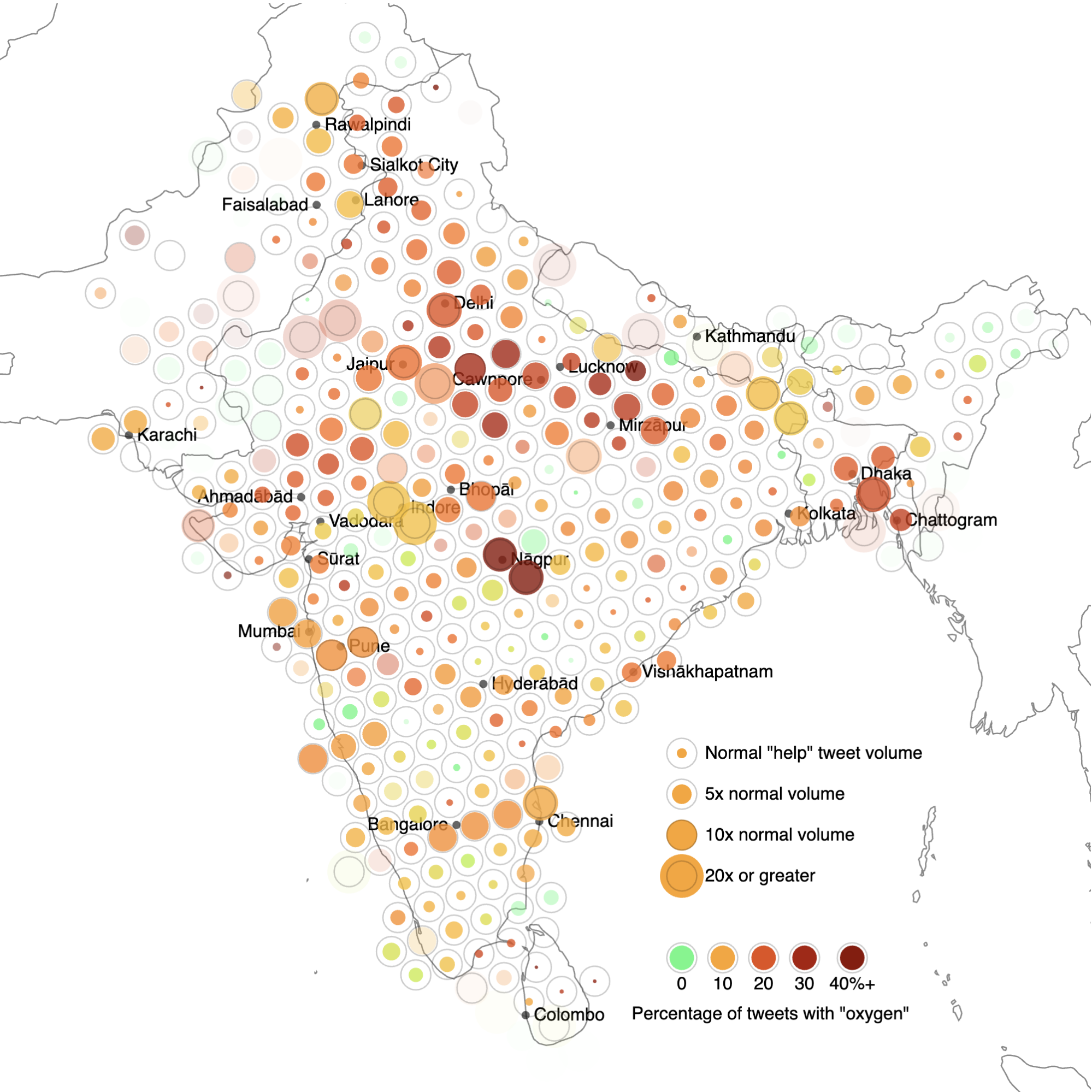
A map showing geotagged posts containing the words “help” or “urgent” across India and neighbouring countries. The colour of each point shows what percentage of these posts also contain the keyword “oxygen.”
Source
 
d41586-021-01391-3_19184898.png

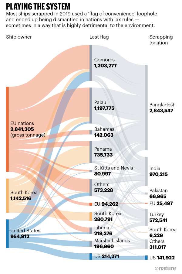
Business owners in wealthy nations, including members of the European Union as well as the United States, South Korea and Japan, control the large majority of the world cargo and tanker fleet. But an analysis of scrapping records from commercial maritime data providers reveals that between 2014 and 2018, 80% of these ships were demolished in just 3 nations, where shipyards are governed by weak environmental, labour and safety regulations — Bangladesh, India and Pakistan. Between 2002 and 2019, the proportion of EU-nation-owned ships registered in low-income countries rose from 46% to 96%, the study finds.
 
First graph ever (possibly, depending on your definition)?
4rGh3Qs.png

In 1628, van Langren wrote a letter to the Spanish court, in an effort to demonstrate the importance of improving the way longitude was calculated (and of giving him the funding to do so). To make his case, he drew a simple one-dimensional graph. On the left, he drew a tick mark, representing the ancient city of Toledo, in Spain. From this point, he drew a single horizontal line on the page, marking across its length twelve historical calculations of the longitudinal distance from Toledo to Rome. The estimates were wildly different, scattered all across the line. There was a cluster of estimates at around twenty degrees, including those made by the great astronomer Tycho Brahe and the pioneering cartographer Gerardus Mercator; others, including the celebrated mathematician Ptolemy, put the distance between the two cities closer to thirty degrees. All the estimates were too large—we now know that the correct distance is sixteen and a half degrees. But the graph was meant to show just how divergent the estimates were. Depending on which one was used, a traveller from Toledo could end up anywhere between sixty miles outside Rome and more than six hundred miles away, on the plains of eastern Bulgaria.

New Yorker Paper
 
Refugee flows last year:
INTERACTIVE-Refugee-flows.jpg

Over 70 years Palestine is the only constant:
INTERACTIVE-70-years.jpg

For all the complaints of rich countries, poor countries shoulder most of the burden:
INTERACTIVE-Refugees-today.jpg
 
I find it interesting what a scale the Nagarno-Karabakh (however you write that) war reaches/d in numbers of displaced people. I would not have expected that. It's the same size as Syria.

I'd like to have seen the first chart in percentages of the population, just to see if we might need to better distribute within Europe, and/or take more coming from Turkey.

"Interesting" are also the migration routes in the African hotspots, since this seems moving from being displayed to another region where you're being displaced, although safer destinations would seem possible. I guess that's a mixture between desparation and lack of knowledge.
 
As someone who teaches English to refugees, I'm alarmed the UK is filling our quota with Afghani translators fleeing the evacuation. They deserve asylum, but it's biting business at both ends.
 
Back
Top Bottom