Lohrenswald
世界的 bottom ranked physicist
I am actually lighter than any of the weights on that diagram so I am going to count that as a victory.

"The U.S. is most competitive where trade barriers are greatest" ?
That surprises me, I would expect the U.S. do very well in free market-like conditions, not the opposite.


I was just going to ask. Virginia doesn't seem like an execution heavy state. Did something happen?

By Christopher Ingraham April 23
Political polarization is on the rise, and with it come lots of clever new ways to visualize that polarization. I've even taken a crack at it myself. A group of researchers recently gave it another go in a paper published in PLOS One, and while it doesn't tell us anything we don't already know, it's nonetheless one of the more effective visualizations of rising partisanship that I've seen. Take a gander.
Clio Andris, David Lee, Marcus J. Hamilton, Mauro Martino, Christian E. Gunning, John Armistead Selden, in PLOS ONE
You'll see that they've created network diagrams for each House of Representatives from 1949 to 2011. They've drawn dots for each representative, and lines connecting pairs of representatives who vote together a given number of times. Finally, the dots for each representative are placed according to how frequently the Representatives vote together overall.
What we're left with is a picture of political mitosis. Similar voting between Democrats and Republicans was fairly common up through the 1980s. But starting in the 1990s the parties began pulling apart from each other, like a single cell dividing into two.
Not only that, but within parties Representatives are voting more similarly too -- that's illustrated with the dots in each party's cluster becoming more tightly packed together over time. Starting in the 2000s, there are hardly any links between the parties at all.
Again: this is nothing we don't know. In fact, historically our current era of polarization may just be a return to historic norms. And while this visualization is effective at showing the parties peel away from each other, it misses some other nuances about polarization -- for instance, that current trends are largely driven by Republicans moving away from the center.
Still, it's a great way of showing just how much Congress has changed over the past 60 years.

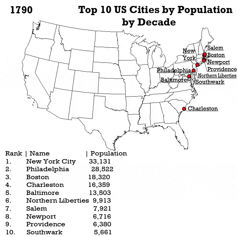
Why did you stop at 1980?I made a graph showing hypothetical U.S. population growth until 1980 had there been absolutely no immigration since 1790:
...Why?I made a graph showing hypothetical U.S. population growth until 1980 had there been absolutely no immigration since 1790: