You are using an out of date browser. It may not display this or other websites correctly.
You should upgrade or use an alternative browser.
You should upgrade or use an alternative browser.
[RD] Daily Graphs and Charts
- Thread starter Winner
- Start date
- Status
- Not open for further replies.
Lohrenswald
世界的 bottom ranked physicist
Humiliation for the fatherland
JohannaK
Heroically Clueless
Luxembourg and Ireland, two tax havems in the heart of Europe.
hobbsyoyo
Deity
- Joined
- Jul 13, 2012
- Messages
- 26,575
Can you find one that compares provinces to US States like this?

BenitoChavez
What business is it of yours?
Can you find one that compares provinces to US States like this?
I found many but they all seem to be different. Here are a few:

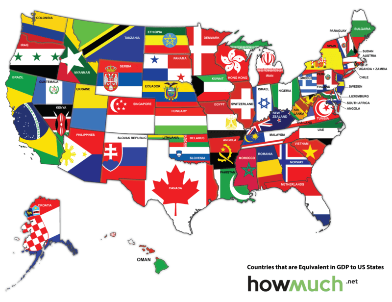
Can you find one that compares provinces to US States like this?
Like the one Benito found, it compares states to other nations, not to Canadian provinces. I suppose you could make one for most provinces. But the basic problem is too much of a mismatch in population. This is why Canadian provinces are mostly compared to Less Developed Countries, and American states to developed or semi developed ones. It's not that the US is that much more developed than Canada is, but rather that the US has 10 times the population of Canada, in addition to having higher per capita GDP. So Ontario has ~13.4million people. Over 1/3 of Canada's total. Which is 600k bigger than Pennsylvania or Illinois, but 6million less than New York. In fact the New York City Metro area alone has about that many people. That compares similarly in GDP to Pennsylvania. But then the provinces get much smaller very quickly.
Lexicus
Deity

Hygro
soundcloud.com/hygro/
I like the democrat's order more but the republican lean more.The graph on the left is Democrats polled. The graph on the right is Republicans polled.
Our progress since the Club of Rome report of "The Limits to Growth" in 1972 is impressive 
.png")
https://www.theguardian.com/environ...-consumed-in-ever-greater-destructive-volumes
https://www.theguardian.com/environ...-consumed-in-ever-greater-destructive-volumes
This unfortunately you have to go to their page to see. Land use patterns in the US.
https://www.bloomberg.com/graphics/2018-us-land-use/
https://www.bloomberg.com/graphics/2018-us-land-use/
Paul in Saudi
Emperor
See if you can spot the subtle mistake on this pie chart.

I do not believe it. I live close to Milton Keynes and could easily buy 2,400 calories including carbs, protein, dairy, fruits and vegetables for less than £7.60.
The above proves that more arms in the hands of the people is good. That way armed shooters can remove themselves from the scene themselves and law enforcement need not waste money on costly internal affairs investigations of officers shooting people. Unarmed shooters would be a lot of trouble and red tape.
- Status
- Not open for further replies.