definitely not, read below
comments to image 02 :
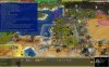
(1) this encircled area is bold and hIghlighted, what is different to C2C. It is not so good to see in this screenshot as it is in reality for me, but it is very intrusive and it should not be bold, that is too fat on my screen. It may be highlighted, but not bold.
(2) this is much to wide, should be smaller, 2/3 of it or better 1/2, and then with line break, what is not working here. It can be higher, if it is smaller and more transparent background.
Also, kill the blue background, that always is a annoying stain in left canthus, the more, as it is too wide.
Ah, I thought you meant the content of the text which is defined in an xml not modified by neither C2C nor PPIO.
Yes I may have made that text bold in the python code that place it there as a courtesy to our 60+ aged players and modders on the team, as well as for any younger ones with troubled eyesight.
Also, how I set that font also to Arial and w/o bold? Currently, it is hard to read.
The text in the city bar is handled by the dll or possibly even the exe. So I can't help you with that.
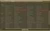
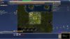
image 03 = BUG Autmatics.
Pretty sure that's unrelated to PPIO, that it is like that without PPIO too.
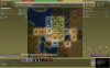
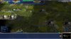
image 05 in city screen
why you changed that? It was good, this is terribe, Left missing the lists for buildings and wonders as before, down and top the symbols are unnecessary big, the BUG option to set their size should work for all. So it is absolute sh*** (sorry). (Wonderung what is is with your eyes or what monitor you have.) I want back the C2C in city screen)
The size of the icons can be changed within the city screen when you open the middle window.
See upper right corner of middle window.

I don't think any lists are missing. Someone would have reported it before you if that's the case.
The tabs for the left and right side lists were changed to icons to accommodate more possible future tabs and fix overlapping text on the lower resolutions where there is less space for the side panels.
(and again, all in bold where no bold is needed. Remove that bold. You shoud go to the doctor and let check your exes)
My eyes are fine, my "shortcoming" is apparently to care about those who are not so lucky.

Bold text does look better with the sylfaen font than the Arial font, I can give you that, but sylfaen is the original BtS font, and I'm not gonna change that or accommodate any other fonts by limiting what can be done with the original sylfaen font.
If you don't like bold text why don't you just make bold text non-bold in the
C2CTheme_Common.thm file that you've already modified.
now I had a complete look inside, and I'm shocked because the design, in map and city screen. I be VERY unhappe, all intrusive candy-colored and buttons like smartphone or win10
you're a good programmer, but a terrible designer. Stick to your skills, graphic design is not one of them.
I have never owned a smart phone, and have adjusted my windows 10 to appear as close as my old XP system did as is possible. ^^
If you haven't already, check out "classic shell" or even its successor "open shell" which were originally meant to make win 7 look and work like older OS's like 98, 2000, and XP.
Classic shell really got popular when win vista and 8 came along. ^^
You are right that I'm not a graphic designer (not a programmer either to be honest), although I did revamp the loading background, most of the leaderhead pictures, most of the terrain textures, made the giraffe/llama/mapinguari/bison/tiger/etc models and animations as well as other stuff in C2C.
If you think this is a brilliant design:
The constricted two line build list in cities that jump to the top of its scrolling every time you select something to build, having to scroll through loads of lines looking for what you want over and over again.
Fixed with a big relaxing and non-nerfig build list in PPIO.
Or tooltips that too often to be funny disappear off the screen due to their height.
Fixed in PPIO due to a dynamically adjusted tooltip width.
Any text line menat for the tooltip that should have linebreaks should also define those linebreaks in the text and not rely on it happening only due to a constricted width.
The whole interface is "fine, click me", maybe nice for a game for 6-year-olds who like funny clicking around, but not for a strategy game like Civ4.
Not sure what you are talking about or how PPIO reduce the strategy element of Civ4.
Sorry, but with such a design I don't care how great the technical improvement is. I don't look at something like that, I don't play it. Use your skill genes for C2C, without a new design.
Use your troll genes to troll threads that deserve trolling, like some political extremist forum or something.
Your tone is not appreciated, and no one is forcing you to use this modmod.
Or: add a C2C look identical version if you love such a design.
What do you even mean by that?
The design in this modmod is very close to original BtS, while your font and panel coloration is a fixation on a specific design that is far from the original.
If you have a problem with this modmod not changing something (like the blue panel coloration) then that's not my problem.
A modmodmod will have to be responsible for creating non-original design for PPIO.


 IT IS FINE ! (nearby)
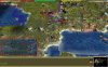

")