mythmonster2
BEC NOIR! RUN!
How would having less categories make it more informative?
Uh...could you make that a bit more readable? For example by having quintiles rather than by 10s.
Like top 20%, 20% to 40%, 40% to 60%, 60 to 80%, and bottom 20%. That would be more readable and more informative.
 Good thing that they stopped doing this in 2000.
From here.In designing the framework for health system performance, WHO broke new methodological ground, employing a technique not previously used for health systems. It compares each country’s system to what the experts estimate to be the upper limit of what can be done with the level of resources available in that country. It also measures what each country’s system has accomplished in comparison with those of other countries.
WHO’s assessment system was based on five indicators: overall level of population health; health inequalities (or disparities) within the population; overall level of health system responsiveness (a combination of patient satisfaction and how well the system acts); distribution of responsiveness within the population (how well people of varying economic status find that they are served by the health system); and the distribution of the health system’s financial burden within the population (who pays the costs).
USA 31-40!!!
China #141-150!

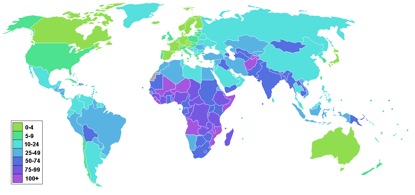
Countries by infant mortality rate:

Self employed farmers, yay!!North Dakota, South Dakota, and Nebraska #1!


