[RD] Daily Graphs and Charts

Status
Not open for further replies.
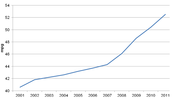
May as well post this here too. Average fuel economy of new cars in the UK: (NOTE THE SCALES!!)

SMMT_average_mpg.png

http://www.smmt.co.uk/2011/12/november-new-car-market-down-but-fuel-efficiency-is-better-than-ever/
 
Note that it is the average of cars sold that year, not of the average car on the streets.
 
And so the banana-republicanization of the US continues...
Sadly, things in Europe are developing the same way, just on a smaller scale.
 
Sad, but unsurprising. It in the end is a natural force of a free market - unless "the cake" growths significantly or the economic system experiences some significant game changer, then things can be different. Otherwise, it is only a matter of time that the wealth gap grows bigger and incomes diverge further.
After all, "free" in this context in the end means that the stronger get stronger and the weaker weaker. There is no reason this shouldn't apply to different wealth/income groups.
 
But the cake has got bigger, it's just that the chart shows how much each person's share has grown relative to the average for some unspecified previous period. It's pathetic and dishonest that they put this as a little asterix at the bottom, rather than calling attention to it in the title of the chart. The title of the chart should be "difference between the average growth in income between 1979 and 2005 and the average growth in income for some unspecified time period before 1979". Of course, that might have just made people stop and think for a moment about how difficult it is to make sense of the chart in the first place... Why not just draw an index for each group from 1900 to now or something? It's much easier to visualise then... because it's already visualised for you...
 
But the cake has got bigger, it's just that the chart shows how much each person's share has grown relative to the average for some unspecified previous period. It's pathetic and dishonest that they put this as a little asterix at the bottom, rather than calling attention to it in the title of the chart. The title of the chart should be "difference between the average growth in income between 1979 and 2005 and the average growth in income for the N decades preceeding 1979". Of course, that might have just made people stop and think for a moment about how to interpret the chart correctly.

I think you've found yourself a little lost here, they've put the information there to flag the information you're thinking they are trying to hide. The info in the asterix is a critical part of the chart. The chart indicates how the structure of US society has changed: this is the most important information for understanding socio-economic power relations.
 
Fair enough, I didn't click the link to see the context. I still think the asterisk should be the title though.
 
But the cake has got bigger
Yes, but not significantly. And with significantly I mean growth rates beyond 2 or 3%. Meaning the growth must have a significant impact on the structural situation of the economy to counteract what I called a natural force in my last post (though there is no guarantee it will).

As to the graph - it really sucks that it doesn't specific the exact time period it compares to. But the basic idea is IMO very good, as it very vividly demonstrates a general socioeconomic trend and makes clear the monetary consequences of this trend.
It's pathetic and dishonest that they put this as a little asterix at the bottom, rather than calling attention to it in the title of the chart. The title of the chart should be "difference between the average growth in income between 1979 and 2005 and the average growth in income for some unspecified time period before 1979".
To be fair - this Asterix isn't actually small. As far as graph notations go, it is very big. And I would argue that with a title and a timescale missing in the actual graph one is bound to look at it to make any sense of the graph in the first place.
 
Here's how real, net household income distribution changed here during the last Labour government (1997-2010):

PMydq.png


Real means after accounting for inflation. Net means after taxes and benefits. Household means "equivalised" income - they do some modelling to treat all households as if they were the same, so that a couple with no children would have a higher equivalised household income than a couple with 2 children, but a lower equivalised household income than a single person, even if they had the same real net household income. Source: http://www.ifs.org.uk/comms/comm118.pdf

The third graph shows that the income distribution has not only got flatter, but it has also shifted to the right: people simultaneously grew richer and more equal over the 13 years of Labour government.
 
From the same source as above, here's how real income per quintile grew under Labour vs the previous Conservative governments:

XaN8x.png


The 3rd graph in my previous post is much more instructive though, because people shift between quintiles as their income rises or falls, so it's hard to account for that in a straight look at quintile income.
 
@Mise
When the graph flattens, it means that groups with different incomes gain size in relation to each other. Which means greater inequality, not equality like you suggested. What is more equal is the distribution of said inequality in terms of the size of the different groups. So one can say that income distribution in the UK has become more diverse.
Equality / Diversity
 
How do you figure that? For example, if 10 people earn $10,000 per year, and 1 person earns $100,000 per year, then this is an unequal society. If 4 of those originally poor people suddenly start earning $50,000 per year, then the curve flattens, and the society is more equal.

I don't accept a conception on "income equality" that fails to recognise this.
 
Since we're talking about inequality, here's an OECD graph and some comments:

ineqtrends.jpg

Edit: I don't know why the graph isn't loading, here's the link:
http://imageshack.us/f/207/ineqtrends.jpg/

Income inequality followed different patterns across OECD countries and there are signs that levels may be converging at a common and higher average. Inequality first began to rise in the late 1970s and early 1980s in some Anglophone countries, notably in the United Kingdom and the United States, followed by a more widespread increase from the late 1980s on. The most recent trends show a widening gap between poor and rich in some of the already high-inequality countries, such as Israel and the United States. But countries such as Denmark, Germany and Sweden, which have traditionally had low inequality, are no longer spared from the rising inequality trend: in fact, inequality grew more in these three countries than anywhere else during the past decade. However, some countries recorded declining income inequality recently, often from high levels (Chile, Mexico and Turkey).
Where is the increasing income inequality coming from: wages, employment or capital incomes?
Increases in household income inequality have been largely driven by changes in the distribution of wages and salaries which account for 75% of household incomes of working-age adults. With very few exceptions (France, Japan and Spain), wages of the 10% best-paid workers have risen relative to those of the 10% least-paid workers. This was due both to growing earnings’ shares at the top and declining shares at the bottom, but top earners saw their incomes rising particularly sharply (Atkinson, 2009). The highest 10% of earners have been leaving the middle earners behind more rapidly than the lowest earners have been drifting away from the middle.

Earnings inequality also depends on the type of jobs people hold and their work arrangements. Since the mid-1980s, women’s employment has grown much more rapidly than that of men. But many women work part-time and earn less which explains part of widening earnings gaps among the workforce. On average across the OECD, the share of part-time employment in total employment increased from 11% in the mid-1990s to about 16% by the late 2000s, with the strongest increases observed in some European countries (OECD, 2010). But rich and poor people were not affected by these changes in working-time arrangements in the
same way. Average annual hours worked per person in dependent employment fell slightly in most OECD countries over the past ten years. But more working hours were lost among low-wage than among highwage earners, again contributing to increasing earnings inequality.
http://www.oecd.org/document/4/0,3343,en_2649_33933_41460917_1_1_1_1,00.html
http://www.oecd.org/dataoecd/32/20/47723414.pdf

A summary of interesting finds:
-Over the las decade, inequality has increased more in relatively equal countries such as Germany and Finland than the US or the UK;
-The increase of women's share of the labor force has increased inequality, as women make less than men;
-Inequality was also fueled by the fact that the hours worked by poor people have fallen more than those of rich people.

I think we can agree that it's a far more complex phenomena than "rich bankers and CEOs stealing larger and larger shares of the pie".
 
if 10 people earn $10,000 per year, and 1 person earns $100,000 per year, then this is an unequal society. If 4 of those originally poor people suddenly start earning $50,000 per year, then the curve flattens, and the society is more equal.
On what is this assumption based? That the gap between the richest and second-richest is smaller? That hardly can fulfill the definition of equality.
For the 100k guy, society has become more equal, no doubt about that. For the bottom six guys, society has become more unequal, there is no doubt about that, too (please say yes). How it is with the 4 now wealthy people is a little bit more complex to determine.
Now has this overall increased or decreased equality? How about we just measure average inequality?

Let's see:
Person 1 with 100k
Group 2 with 10k, with 6 members and who stay poor
Group 3 with 10k and 4 members who get wealthy with 50k

Orginal case:
Person 1 is unequal to Group 1 and Group 2 by 90k. --> x1=90k*10*1
Group 2 is unequal to Group 3 by 0k --> x2=0k*6*4

So the sum of inequalities between all participants is (x1 + x2) $ 900k.

Case two:
Person 1 is unequal to Group 1 by still 90k --> x1=90k*6*1
Person 1 is unequal to Group 2 by now only 50k --> x2=50k*4*1
Group 2 is now unequal to Group 1 by 40k --> x3=40k*6*4

So the sum of all inequalities is now (x1 + x2 + x3) $ 1700k.

When we set those sums in relation to overall wealth...

900k / (100k + 10*10k) = 4,5
1700k / (100k + 6*10k + 4*50k) = (ca.) 4,7

...it turns out, your example depicts a more unequal society :p, i.e. a society where wealth is overall less equally distributed.
But I concede that if you had only allowed one more guy to get more wealthy, the numbers might be on your side.
Which leads to the actual important conclusion made here:
"Flattening" of a graph doesn't necessarily mean lesser or greater equality. It does mean greater diversity. I assume you don't want to claim that those two concepts are interchangeable?
Because if you want to stick to that
I don't accept a conception on "income equality" that fails to recognise this.
then that is what you are doing.
 
What a bizarre way of calculating equality.

In any case, I can't imagine looking at that graph and thinking, "wow, things have really gotten worse over the last 10 years".
 
Status
Not open for further replies.
Back
Top Bottom