Terxpahseyton
Nobody
- Joined
- Sep 9, 2006
- Messages
- 10,759
I wouldn't do so either. Equality is one factor of many to be considered anyway. Likewise, I wouldn't view your scenario to be a bad development even though inequality has increased.
“Did Humans Evolve From Earlier Species?” Miller, Scott, and Okamoto. Science, 2006

I wouldn't do so either. Equality is one factor of many to be considered anyway. Likewise, I wouldn't view your scenario to be a bad development even though inequality has increased.
I think SiLL has a point that diversity isn't the same as equality. However, I think the graphs very clearly indicates that things have changed for the better. The difference is, I guess, in which "direction" the graph flattens. If incomes at $10k change to $50k, things have changed for the better. The graph flattens, too, when they change to $8k, but that's obviously not a good thing.


Wow, cool, had no ideaAll you had to do was divide your 4.5 and 4.7 by 11 (i.e. the total population), and you end up with the respective Gini coefficients.

Each node denotes an ingredient, the node color indicates food category, and node size reflects the ingredient prevalence in recipes. Two ingredients are connected if they share a significant number of flavor compounds, link thickness representing the number of shared compounds between the two ingredients. Adjacent links are bundled to reduce the clutter. Note that the map shows only the statistically significant links, as identified by the algorithm of Refs.28, 29 for p-value 0.04. A drawing of the full network is too dense to be informative. We use, however, the full network in our subsequent measurements.

I hate Mushrooms
Indeed. And also it carries such a rubbery, disgusting texture!
 I can't tolerate mushrooms either.
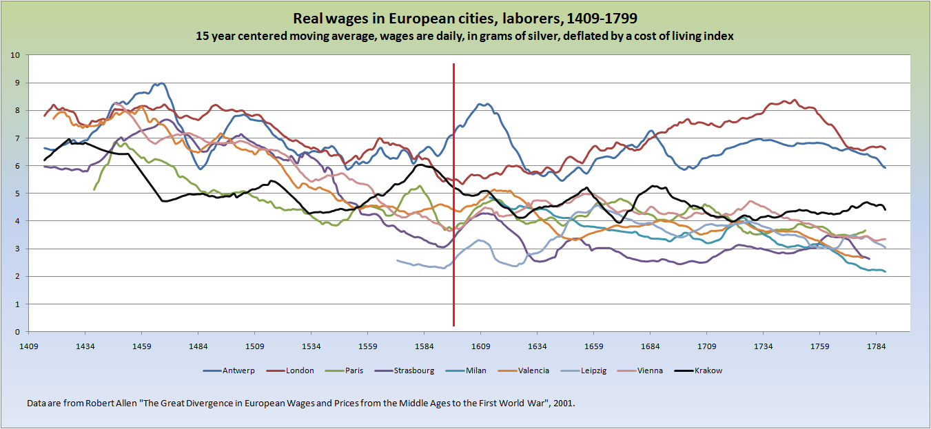
This graph is cool:
Spoiler :