[RD] Daily Graphs and Charts

Status
Not open for further replies.
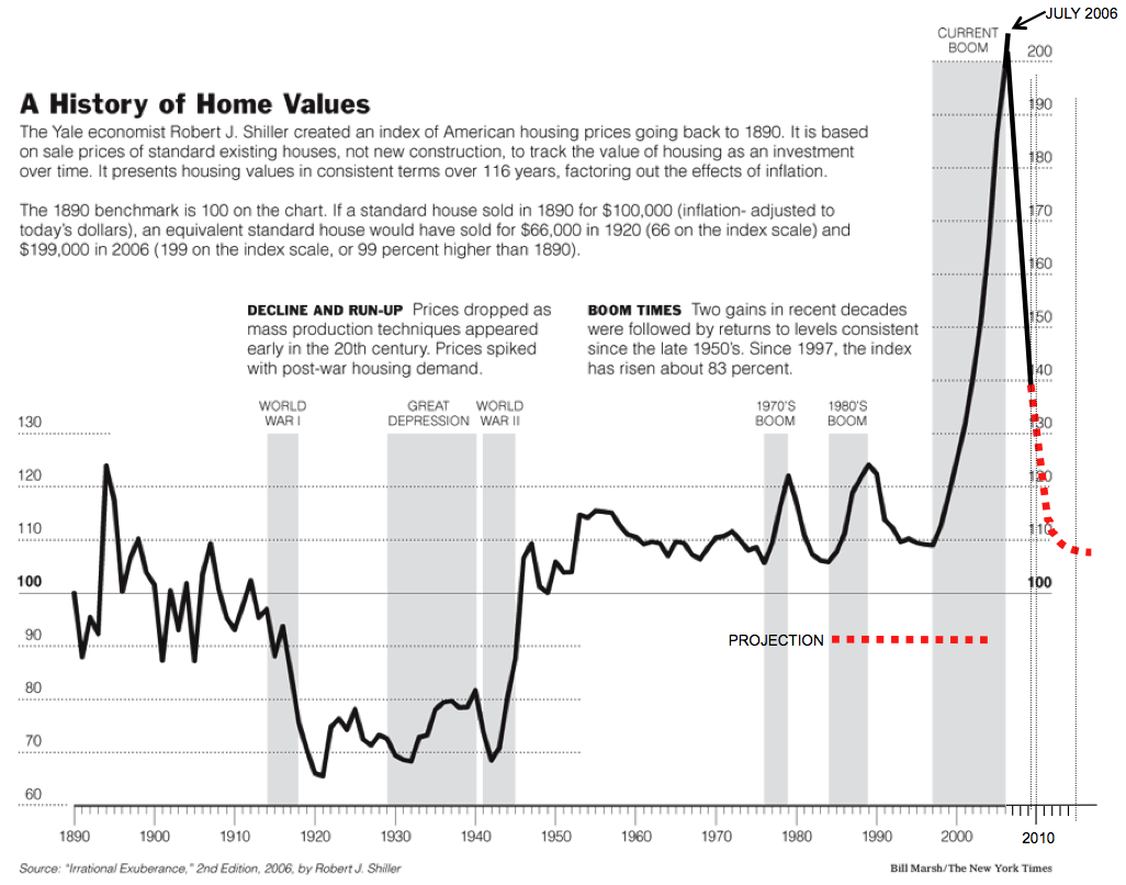
http://www.census.gov/hhes/www/housing/census/historic/owner.html <-- this thing says that homeownership was actually a lot more common than I thought (46% in 1900). I still find it odd that homeownership has risen even as prices have risen.
I think thebolded part below answers your question.
Most of the national population was rural. So they had to have houses, as there was little in the way of apartments in rural areas. As to how fair that comparison is, hard to say. There wasn't the land competition as in cities, but rural people also had very low incomes. So the houses represented a very large part of their purchasing power. And what houses were purchased were mostly without mortgages.

It's much easier to get credit today than it was then. Which allows both prices and ownership rates to rise together.
 
case-shiller-updated.png

Is housing still dropping like a rock? I'd heard it had turned the corner.
 
I think thebolded part below answers your question.


It's much easier to get credit today than it was then. Which allows both prices and ownership rates to rise together.
Yeah, that makes sense. Thanks both of you. I guess a "fair" cost metric would take into account cost of capital. But then the graph doesn't aim to show "cost" at all, just sold prices, so I can't really blame it for that.
 
it has turned; that graph is from before 2010 as you can tell by the line delineating the observed from the projected.

the current growth rate is far above the rate of inflation. more than 10% above it if I recall.
 
Funny story about a Russian in Oregon.

In Oregon the environmentalists are very strong and kind of unique as well since they actively work to improve the environment. In this one case a ton of $ was spent to bring a species of river trout over from Siberia to replace one that had been wiped out of the streams somehow. Logging, golds mining, lots of stuff, who knows. So these fish were flown over direct, like what's his name, in their own jet. They were taken to the target steam and released. A bunch of happy Oregon environmentalists were the result and one happy Russian. He took his illegal net and did some illegal fishing and caught every one of those Russian trout. When the environmentalists went back and found the mess they started a manhunt in the forests. The Russian fish eating Russian was caught and is likely still rotting in a prison somewhere.

Another thing I like about that map is that the Germans have the Polish completely surrounded.
 
But that's just a 1 month anomaly measure - it's a snapshot that doesn't say anything at all about a trend. I'd be very interested in a trend map like that over a, say, 60 year period.

EDIT:
And it's totally scary big. MV didn't give enough of a warning in the spoiler, IMHO :mischief:
 
The Philippines exports a lot of semiconductors and electronics? What?
 
TIL: Papua New Guinea has large CAT factories somewhere.
 
Major linguistic-cultural circles of Europe (Slavic, Romance, Germanic, etc.):

http://postimg.org/image/rvywh6glr/full/

Europe_lang_cult.png


And percent of total Eurasian population living within each of European circles:

Countries_Europe.png


Share of each Slavic country among the total population of all Slavic countries:

Slavic_states_pop_1991.png


====================================

Amazing how Slavic people expanded from one "Belarusian swamp" :lol: into half of Eurasia and overwhelmed it.


Link to video.
 
Status
Not open for further replies.
Back
Top Bottom