You are using an out of date browser. It may not display this or other websites correctly.
You should upgrade or use an alternative browser.
You should upgrade or use an alternative browser.
[RD] Daily Graphs and Charts
- Thread starter Winner
- Start date
- Status
- Not open for further replies.
SS-18 ICBM
Oscillator
Traitorfish
The Tighnahulish Kid
"Because", as the Irish used to say, "even God wouldn't trust the British in the dark".
SS-18 ICBM
Oscillator
I love that quip so much. So it was the Irish that came up with it? There seems to be quite a few people quoted for it.
Anyway,
Anyway,
Timsup2nothin
Deity
- Joined
- Apr 2, 2013
- Messages
- 46,737
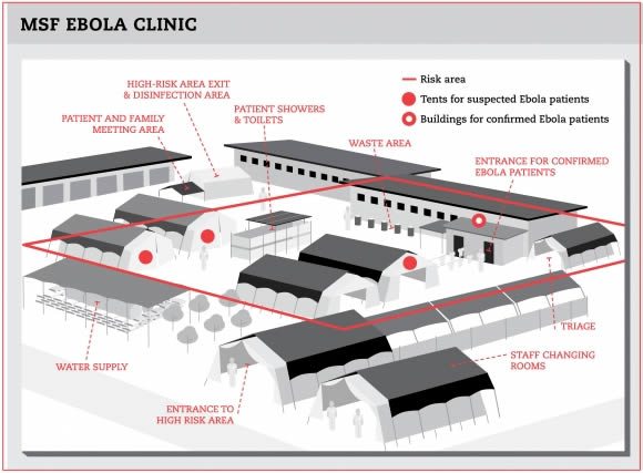
So once you get the ebola you get to go in a building, but until you do you have to stay in the tents with the other people who may have caught it but may also still be trying just like you. Makes sense.
SS-18 ICBM
Oscillator
Well, Ebola isn't MERS-CoV.
Anyway,

Anyway,
Mise
isle of lucy
That's cool.
classical_hero
In whom I trust
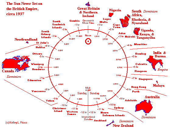
Whomever made the last picture is wrong, because the southern ocean goes all the way to the South Coast of Australia. There are some areas where the various ocean meet and those are quite violent regions because there is different heights of the oceans.
That's just what this country claims. http://www.theage.com.au/articles/2003/12/21/1071941610556.htmlWhomever made the last picture is wrong, because the southern ocean goes all the way to the South Coast of Australia. There are some areas where the various ocean meet and those are quite violent regions because there is different heights of the oceans.
The main international view is that it goes up to 60 degrees south.
KMRblue1027
Deity
There's a Southern Ocean? I have literally never heard of that before. 
Timsup2nothin
Deity
- Joined
- Apr 2, 2013
- Messages
- 46,737
I always thought it was the Antarctic Ocean...which made it much clearer that it had nothing to do with the confederacy.
Atlantic Pacf.
Back from the dead
- Joined
- Jul 20, 2012
- Messages
- 400
You know, with Britain owning the Pitcairn Islands and such, the sun still doesn't set on the British Empire.
classical_hero
In whom I trust
That's just what this country claims. http://www.theage.com.au/articles/2003/12/21/1071941610556.html
The main international view is that it goes up to 60 degrees south.
You learn something new.
Anyway a new graph to get everyone talking.

Source
Monsterzuma
the sly one
- Joined
- Jun 1, 2008
- Messages
- 2,984
before and after applying the infamous "trick"?
tokala
Emperor
I already posted this gem at least once:

But I just noticed that there is a complementary history of projection failure for the "other side":

")
Second picture and quote from this article:
http://theenergycollective.com/oncl...-renewables-growth-been-so-much-lower-out-tur
First originates from TOD, I suspect.
But I just noticed that there is a complementary history of projection failure for the "other side":
The International Energy Agencys (IEAs) annual World Energy Outlook (WEO) is a thorough and well researched analysis of the outlook for the worlds energy systems. Over the years it has become the standard view of the worlds energy use now and in the coming decades.
Second picture and quote from this article:
http://theenergycollective.com/oncl...-renewables-growth-been-so-much-lower-out-tur
First originates from TOD, I suspect.

cybrxkhan
Asian Xwedodah
That DC map is interesting. Seems like the area I used to live in was a border zone between the high income and middle/mixed income.
- Status
- Not open for further replies.
Similar threads
- Poll
- Replies
- 120
- Views
- 8K