No, but very much closer.Nationals' assets squirreled away overseas.
You are using an out of date browser. It may not display this or other websites correctly.
You should upgrade or use an alternative browser.
You should upgrade or use an alternative browser.
Guess the map 13: Mercator maps are cool, actually
- Thread starter Lohrenswald
- Start date
- Status
- Not open for further replies.
EnglishEdward
Deity
Millionaires living abroad.
No, colder. Hotter and colder are the right words for closer or further away, yes?Millionaires living abroad.
Last edited:
Kouvb593kdnuewnd
Left Forever
- Joined
- Jul 3, 2012
- Messages
- 4,146
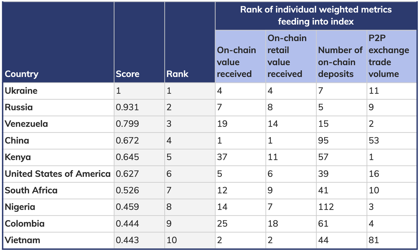
To me it look something like wealth inequality, Ukraine and Russia at the top and some like US, South Africa and China is pretty bad.
No, colder.To me it look something like wealth inequality, Ukraine and Russia at the top and some like US, South Africa and China is pretty bad.
No, but getting much warmer.tax avoidance?
Kouvb593kdnuewnd
Left Forever
- Joined
- Jul 3, 2012
- Messages
- 4,146
Kouvb593kdnuewnd
Left Forever
- Joined
- Jul 3, 2012
- Messages
- 4,146
Here is the map

Kouvb593kdnuewnd
Left Forever
- Joined
- Jul 3, 2012
- Messages
- 4,146
Dont forgot North Korea and South Korea.Is that it? The UK, France, Germany, Russia, China and the US?
Kouvb593kdnuewnd
Left Forever
- Joined
- Jul 3, 2012
- Messages
- 4,146
Well on a better map it should only be one Korea. It is not related to nuclear or a treaty.So... first guess: Related to either something nuclear, or an international treaty related to the Koreas?
(yes, trying to take the low hanging fruits here)
Can you tell us which Korea?Well on a better map it should only be one Korea. It is not related to nuclear or a treaty.
Kouvb593kdnuewnd
Left Forever
- Joined
- Jul 3, 2012
- Messages
- 4,146
Roughly a united Korea.Can you tell us which Korea?
Kouvb593kdnuewnd
Left Forever
- Joined
- Jul 3, 2012
- Messages
- 4,146
Well no, not trying to give too much of a hint but Joseon dynasty period have relevance and don't forget the other countries colored since they also have relevance.Separatist movements and the opposite, whatever you call the movement to unify Korea.
Kouvb593kdnuewnd
Left Forever
- Joined
- Jul 3, 2012
- Messages
- 4,146
It is the closest answer yet but it is still far away. History do have importance to the map in a specific sense but the answer is not about history if that make sense.So this is a historial situation...?
- Status
- Not open for further replies.
Similar threads
- Replies
- 1K
- Views
- 56K
- Replies
- 1K
- Views
- 55K

