Is it me, or is most of the US state flags ugly?

My hometown ought to secede from Missouruh and either unite with Kansas City to keep Missouri a state or become a city-state by ourselves. We have a distinct cuisine, accent, holiday practice, and religious makeup compared to Missouruh, and more importantly, a classy-enough flag to pull it off:
StLouisFlag.jpg

http://www.flickr.com/photos/11581147@N06/3256553659/
 
I like the Canadian flag, and the people there definitely seem to take it to heart - you can't walk anywhere without seeing people wearing it! The silver fern is a little complex, not as much as some of the flags with images of people in the US state flags we're seeing, but it's easier to draw than you think. It's just a bunch of skinny black triangles on the basic white shape of the fern.

Depends where you go, we did just have Canada Day 12 days ago. However, the only Canadian flag that I usually see around my town is the one on top of Superstore.
 
I like simple, colour coordinated and symbolic flags but there are exceptions for me.

Out of the American state flags? My favourites are the flags of New Mexico, Alaska and this is surprising, Texas. They're all simple, and the colours don't clash so much with each other. They're also display representative symbols from the states they come from.

For my country's flags, I like New Brunswick's (I know it's hella complicated but I like it), Nova Scotia's, Quebec's and Newfoundland's. I'm not a big fan of the flags with the Union Jack on them.

New Brunswick's flag hasn't been posted on this thread yet, so here it is:

zflagnewbrunswick.gif


And a final special mention back in Canada for the flag of French Ontario, which is pretty cool in my opinion.

600px-Franco-Ontarian_flag.svg.png

I agree with Oda here, mostly because I'm biased since it's part of my heritage :P
 
And what does that have to do with rebellion? They rebelled from Mexico, not the US, and joined the US voluntarily.
So Texas is a double traitor state. Twice as much rebel as the other regular traitor states.
More or less. It's a conscious effort on the part of most Texans who care about this sort of thing - i.e. "most white Texans" - to evoke a sense of autonomy and/or independence. Sure, they've never seceded from the United States by themselves while flying that flag, but I think that's kind of missing the point.
 
While modern Russia isn't know for good design tradition, some flags here do look interesting:

Spoiler :

Moscow (poking a dragon like a boss):
800px-Flag_of_Moscow.svg.png


Archangelsk:
800px-Flag_of_Arkhangelsk_Oblast.png


Ryazan:
800px-Flag_of_Ryazan_Oblast.png


Tula:
800px-Flag_of_Tula_Oblast.svg.png


Vologda:
Flag_of_Vologda_Oblast.png


Vladimir:
800px-Flag_of_Vladimirskaya_Oblast.png


Yaroslavl:
800px-Flag_of_Yaroslavl_Oblast.png


Kirov:
800px-Flag_of_Kirov_Region.svg.png


Penza:
800px-Flag_of_Penza_Oblast.png


Pskov:
600px-Coat_of_Arms_of_Pskov_oblast.png


Ulyanovsk:
Flag_of_Ulyanovsk_Oblast.png


Astrahan':
774px-Flag_of_Astrakhan_Oblast.svg.png


Krasnoyarsk:
509px-KrasnoyarskKray-Flag.svg.png


Is the flag of Yaroslavl seriously a bear with a Berdiche axe?:eek:
I think I found the most awsome thing in existence.
 
Is the flag of Yaroslavl seriously a bear with a Berdiche axe?:eek:
I think I found the most awsome thing in existence.

Yup. This one is poorly done though. I'll try to find the one of the times of Russian Empire, where heraldry was srs bzns.
 
Vologda wins for looking most like something straight out of Monty Python
 
Holy hand grenades, Batman!
 
The North American Vexillological Association has the following recommendations on making a "good" flag:

1. Keep It Simple (The flag should be so simple that a child can draw it from memory.)

2. Use Meaningful Symbolism (The flag’s images, colors, or patterns should relate to what it symbolizes.)

3. Use 2–3 Basic Colors (Limit the number of colors on the flag to three, which contrast well and come from the standard color set.)

4. No Lettering or Seals (Never use writing of any kind or an organization’s seal.)

5. Be Distinctive or Be Related (Avoid duplicating other flags, but use similarities to show connections.)
 
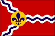
I'm actually going to agree when it comes to Missouri, because it's an example of a seal-bearing flag done properly. Most just seem lazy- "Quick, slap a logo on a blue sheet!"- but there's actually a bit of consideration as to the composition of the seal in relationship to the tricolour on that one, and it remains distinctive even if the detail of the seal can't be made out, so it gets a thumbs up from me. :goodjob:

I agree here--I don't mind seals if they are well-integrated. For sub-national units, a seal defacing the national colors works as well (except in the US, unless you replace the stars with the seal and leave the stripes). Missouri did it well. Even Massachusetts because the colors are simple and the text is small. Gold figure on blue shield on white.

The lone symbol on a field is always a great way to go. Alaska, New Mexico, thumbs up. Indiana should also be in this category, surprised it didn't get more votes. Sure, it has tiny text, but it's barely noticeable!

I hate the Hawaiian flag. At most, two colors in your stripes, not three in a non-symmetric pattern! Colorado's stupid pacman design also gets a thumbs-down. I like Ohio because of its atypical shape and use of the national colors. Also was born there so I suppose I've gotten used to the pennant shape. The new Georgian flag, if it didn't have words, would have been a shoo-in for the top as well.

As for territories, Puerto Rico has a nice, heraldric flag and the American Samoa has an interesting-looking one. It's striking, even if a bit complicated on the eagle.

Here's a link to the city flags, which are more hit-or-miss. I like the City of Washington flag as well. Simple, two colors, kid could draw it from memory, and it's George Washington's coat of arms (historical significance: check). Other ones like Indianapolis, Wichita, St. Louis, and New York look good. Boston is boring, and you'd think a city with that kind of history would have one that pops. For a spectacular flag failure, look at Easton.
 
My opinion:
1)Texas - beautiful simple flag
2)New Mexico - simple, symbolic and unique...good choice
3)Tennessee - this flag is well designed, small problem shall be pulling of stars in right directions
4)Alabama - it works well, but I think that I have seen such flag already in games as flag of Spain
5)Arizona - borderline, it has good idea but looks strange in the end
6)Alaska - too many and too small stars, but well if you have seen Australian or NZ flag, its not that bad...

Other flags are imho not good...
 
Well I thought Georgia's flag from the 90s was pretty good.


Flag_of_the_State_of_Georgia_%281956-2001%29.svg
 
Back
Top Bottom