The Ultimate Map Thread

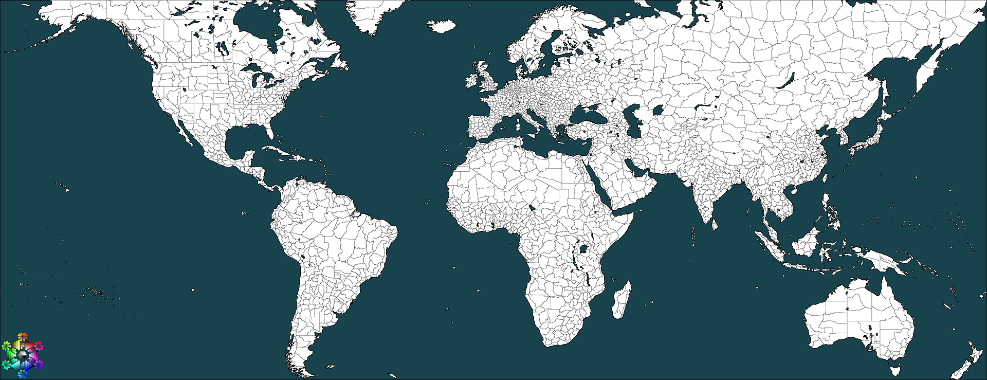
Here's another one from Workshop Starlife (hey it's summer now and... I'm bored). This one was designed to serve as the map for a New World / colonialism PBEM / tabletop supplement with some friends. The game I designed for us is kind of about survival first, and then nation-building second. We have been thinking hard about natives, and we think there should be a ton of them. They can make or break a colony.
The second "rules" we came up with when we last all got together was actually playing as the natives, with the NPCs being the colonial powers.
And last but not least, the very final idea we came up with during our last meeting was even basing this in a more ancient setting - so 'ancient world' colonies or perhaps even ancient world civilizations.

Whatever we decide (at this point we are leaning towards idea 1, which is each player as colonials attempting to establish a colonial empire), we'll have it going during the later part of the summer. The map needs a lot of work, but here is what I have so far. I need to add some geographic features, which is the most notable thing missing. Though it will be very minimal compared to Ethereal's map (and obviously different because it is a historical-fiction setting, not pure fantasy-fiction).

Just sharing...

Spoiler :
 
oh wait I have explicitly stated I use GIMP for special effects before.

Dang, and your burn was so well crafted, too! :(
 
I think I used that same stock photo on my recent PBEM map. It was faster. But usually I make my own old paper, and I recommend you do it, too. If you do that, you can put wear and tear in all the logical places. Plus then it is more 'yours'. I can give you step-by-step instructions on how to make old paper in GIMP from scratch (and sometimes I literally make it IRL and scan it). I also recommend bringing the opacity on the old paper layer down a bit - it is kind of overwhelming at this point, will be moreso when you have more info on it. There are also many image fragments on your .jpg - maybe try saving it as a .png.
 
That looks exceptionally bad!
 
Here's what I've been working on for the past 2 days. Would have been done at the beginning of this week had my computer not corrupted the original, forcing me to start from scratch. FC--are the mountains 'sharp' now?

Still a WIP.

Spoiler large image :
 
In the very far off future, for SLNES II (I say far off future because I am devoted to SLNES I and want to see it last for a long, long time)...

I want to run a fictional Caribbean-esque NES about pirates and colonialism. For such NES, I have a map which I made ages ago but have changed significantly in recent days. Definitely a work in progress.

I'd like some tips on topographic mountains and hills... as I have so much trouble with them. What other techniques do you guys use? Or... what techniques would look good on this map specifically? I don't want to do iconic mountains (as in Ethereal's map) again - but I might try it just to see what it looks like. I'd prefer a more topographic look for this one, though.

Disclaimer: I had to use .jpeg because .png was over 10mb - too big for Imageshack.

Spoiler :
 
Thanks Anonymoose. I have seen that site (nutra and i were talkin about it in #NES). i'll look around for some mountains tutorials.

i like how the mountains look in 'South Ayerika' but not how they look in the North. :-/
 
Disclaimer: I had to use .jpeg because .png was over 10mb - too big for Imageshack.
JPGs are fine, even ideal, if the image is in its final state, for display and such.
 
Spoiler :


Now all I need to do are the cities and province boundaries. Thoughts? Comments?
 
@Dachs: Sometimes I get image fragments with .jpegs on Imageshack though. It's really annoying. It is more Imageshack than the file, or it could be something wrong with the way I am saving it.

@nutra: looks gooooood.
 
Spoiler :


Me messing around =) Most of you will hate this style, but I like it.
 
There are only 2 things I don't like, really--the hills (right?) to the south-west and the stroking around the roads/the stroke in general. The white REALLY detracts from whatever it surrounds, perhaps a different color will make it less eye-hurty?
 
I agree with nutra about the white bordering. It's not too bad, imo, around the thicker lines but around the thinner black lines, it makes my brainmeats hurt.
 
I agree with nutra about the white bordering. It's not too bad, imo, around the thicker lines but around the thinner black lines, it makes my brainmeats hurt.


Better?
 
Top Bottom