You are using an out of date browser. It may not display this or other websites correctly.
You should upgrade or use an alternative browser.
You should upgrade or use an alternative browser.
Born of Fire: Discussion and Development Thread
- Thread starter RedAlert
- Start date

Sword_Of_Geddon
Arbiter of the Sword
RedAlert
Love one another
I wish I knew how to make title screens because I'd do something with this image:
That's the coolest thing ever!
 It would make a great title screen.
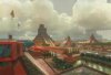
Here are the city graphics I promised, which I just finished this morning. I haven't had a chance to do anything civ-related in the last week and a half or so.
Just the first two eras so far, for both the central american (top pair) and andean (bottom pair) culture groups. The first era of the andean cities is from Emperor Xerxes' Latin American cities.

Sword_Of_Geddon
Arbiter of the Sword
Nice cities Red. Its good to see you back again. I always get afraid whenever you dissapear.
Virote_Considon
The Great Dictator
I agree. Great cities
Stormrage
Ever Present Taskmaster
Best Meso cities evar!
Blue Monkey
Archon Without Portfolio
Hello, hello! I haven't worked much on the map (slow and steady wins the race), but I've been busy busy searching out and working on icons for your tech list.
Yoda Power
✫✫✫✫✫✫✫
- Joined
- Sep 24, 2002
- Messages
- 13,870
Great work on the cities.
Blue - If you want any help on the map, then just give me a call.")

Blue - If you want any help on the map, then just give me a call.
Blue Monkey
Archon Without Portfolio
You've already given me the most valuable help I could ask for with your critique of the old version of the map. The more I looked at it the lousier it was. I tried wrestling with it for hours and hours to incorporate your suggestions, and it just wasn't working. After ruminating on it I decided that the fundamental problem was my initial approach.Blue - If you want any help on the map, then just give me a call.
SoG had asked for a map with certain requirements - mainly Mexico enlarged relative to the rest of the map. I tried starting from another map (Singer's as I recall), moving back & forth between CnP to achieve the desired distortion, BMPtoBIC, & MapTweaker. I just wanted to do something quick & dirty. Distorted, quick & dirty is what I got. The initial request & my conception of it were right. So I backed up to the very first step & started over.
I looked around for a good detailed satellite image to work from (so I could see things like the valleys you pointed out). I then carefully selected pieces to resize relative to each other and CnP back together, in accord with SoG's original requests (discussion started about middle of page 9 in this thread). Here is a reduced scale image of how it looks now.
Please ignore these four artifacts for discussion purposes (they'll be cleaned up & won't appear in the final map)
Two areas of solid color where I had to fill in behind a coastline adjustment on the Gulf Coast
A line caused by the CnP across the middle of Mexico
A section on the south side of the isthmus that needs to be cleaned up.

The major changes (from the real geography) are:
- Mexico & the Yucatan are enlarged
- South America is slightly reduced
- Florida is greatly reduced & shifted north
- Major Caribbean islands are reduced and shifted to approximate their original relative position to the rest of the map
- Lesser Antilles are shifted left (west), away from real world position, so there is still a navigable coastal/sea route from S. America to Cuba
- Does this look good as far as relative sizes of the regions and overall area covered?
- Do you need to see a larger image to be sure I've got the coverage you want?
- Roughly what size map (in tiles) do you want to end up with?
I'm still working on tech icons for you but I'd rather make this a higher priority now that I've found a way to proceed that I'm happy with.
RedAlert
Love one another
Looking at that map, Blue Monkey, I would say that Sword of Geddon pretty much got it right with his specifications. I would like to make a change or two myself, though. Could you extend the map down the Chilean coastline to around Santiago? And also extend the map to the east slightly, to include a little more of Bolivia?
I'm considering doing away with the northern extreme of the map as well, but I'm not sure about that yet.
Otherwise, what you have already is spot on. The relative sizes and positions of the landmasses and islands... perfect. This looks like it is going to be really good.
Take as long as you need, btw, and that's no problem if you leave the tech icons to later.
I'm glad everyone approves of the cities. To be honest, I wasn't so sure about them. I'm the type of person who seems to set too high standards for myself though.
Blue Monkey
Archon Without Portfolio
Okay!
Things to do (with comments):
Things to do (with comments):
- Extend the map down the Chilean coastline to around Santiago? Easy to do
- Extend the map to the east slightly, to include a little more of Bolivia? The original thought was to avoid too much Amazonia. Happy to do this, though. It'll let me readjust the Caribbean islands closer to the real.
- I'm considering doing away with the northern extreme of the map as well. My reluctance was that I wanted to show Baja Calif. connected; That meant Florida shows too, but we didn't want a big backyard for the Aztecs (hence Florida's reduction).
Blue Monkey
Archon Without Portfolio
How's this?

Just S. America in this preview. I've got roughly the top 2/3 of all of Bolivia here. This would let me restore the Caribbean islands to roughly their original positions.
Another question - is going to just south of Lake Titicaca (as pictured) far enough? Extending south would then catch all of Bolivia.
PS: What size map/biq are you thinking about?
RedAlert
Love one another
I would say that's a bit too far to the east. Just to the eastern edge of the andes would do fine, though. As for the southern boundary, I would still prefer to, at most, Santiago, but just short of there is no problem. My concern is not so much fitting Bolivia in as the maximum extent of the Incan empire.
As for the dimensions of the map, a rough guess would be, out of the width and height, an average of about 200 - 250 tiles, but I'm not certain about that yet. I'll give you some more exact dimensions when I decide.
As for the dimensions of the map, a rough guess would be, out of the width and height, an average of about 200 - 250 tiles, but I'm not certain about that yet. I'll give you some more exact dimensions when I decide.
Blue Monkey
Archon Without Portfolio
Sorry for my slow brain. I write down that you want the edge further south, then ask you if it's already far enough.I would say that's a bit too far to the east. Just to the eastern edge of the andes would do fine, though. As for the southern boundary, I would still prefer to, at most, Santiago, but just short of there is no problem. My concern is not so much fitting Bolivia in as the maximum extent of the Incan empire.

I've got the sense of it now. I'll extend it South to about where Santiago is, and make sure the eastern foothills from the Andes are in.
The scale of the first image I showed you is at about 220 E<=>W. Adding a little to the east as we extend the map will still probably keep it under 250.As for the dimensions of the map, a rough guess would be, out of the width and height, an average of about 200 - 250 tiles, but I'm not certain about that yet. I'll give you some more exact dimensions when I decide.
RedAlert
Love one another
Sorry for my slow brain. I write down that you want the edge further south, then ask you if it's already far enough.
I've got the sense of it now. I'll extend it South to about where Santiago is, and make sure the eastern foothills from the Andes are in.
That's no problem
") Sounds like a plan.
Sounds like a plan.The scale of the first image I showed you is at about 220 E<=>W. Adding a little to the east as we extend the map will still probably keep it under 250.
Good! I think in the end the width and height will be about equal.
I think I found a good cut off point for the north:

Blue Monkey
Archon Without Portfolio
Just to double check with you -
I'm leaving for about 7-8 hours but expect to rework the satellite image and post it for you later tonight.
- Should we leave off Florida altogether since only the tip is showing? If we do, I'd leave off the Bahamas also & make Cuba the northernmost island.
- It's ok to leave Baja as an "island"?
- Or do you want to leave Baja off altogether? That would let us bring in the western edge a lot & we'd save time the AI would spend looking through all those ocean squares for no reason.
I'm leaving for about 7-8 hours but expect to rework the satellite image and post it for you later tonight.
RedAlert
Love one another
Just to double check with you -
I'll also do the southern extension as we just discussed.
- Should we leave off Florida altogether since only the tip is showing? If we do, I'd leave off the Bahamas also & make Cuba the northernmost island.
- It's ok to leave Baja as an "island"?
- Or do you want to leave Baja off altogether? That would let us bring in the western edge a lot & we'd save time the AI would spend looking through all those ocean squares for no reason.
Hmm. I don't quite understand what you mean by leaving off (My turn for
). If you mean keeping the northern extent of the map, but taking Florida out, I would rather you left Florida in. If you mean moving the northern border of the map south to exclude all of Florida, then I say that's fine. As for Baja, I would like to keep all of the non-Baja upper Mexican coast, but you can cut off the map anywhere to the west of there you like. I would prefer not to erase any Baja from parts of the map that would otherwise include it, though.I'm leaving for about 7-8 hours but expect to rework the satellite image and post it for you later tonight.
Ok. I'm heading off to bed now anyway

Blue Monkey
Archon Without Portfolio
Here's a new version for your consideration -

Hope this is closer to what you want.
Edit:
I think at the next rework I'll make Mexico & Yucatan about 20% larger.
- Extended south to about Santiago
- Top cut to where you drew the red line
- Removed Florida & Bahamas
- Left Baja in - because of where the top edge is, it does not connect to the rest of Mexico
Hope this is closer to what you want.
Edit:
I think at the next rework I'll make Mexico & Yucatan about 20% larger.
Similar threads
- Replies
- 6
- Views
- 554
- Replies
- 44
- Views
- 9K
- Replies
- 103
- Views
- 13K
- Replies
- 52
- Views
- 8K