You are using an out of date browser. It may not display this or other websites correctly.
You should upgrade or use an alternative browser.
You should upgrade or use an alternative browser.
Guess the map 13: Mercator maps are cool, actually
- Thread starter Lohrenswald
- Start date
- Status
- Not open for further replies.
We need the map at the top of each page please.
...er.... similarities to infectious diseases, and it's about people.
Related to allergies? Although that'd be weird.
So are the values in a way that the log transform actually transforms how we'd perceive them?
Or more clear: Is equatorial guinea a leader by far in this, and would we notice?
Related to allergies? Although that'd be weird.
So are the values in a way that the log transform actually transforms how we'd perceive them?
Or more clear: Is equatorial guinea a leader by far in this, and would we notice?
Most maps here are presented such that colour = f(x, y), with x the principle measure and y the normalising factor. Both of these statements are true for mine....er.... similarities to infectious diseases, and it's about people.
Related to allergies? Although that'd be weird.
So are the values in a way that the log transform actually transforms how we'd perceive them?
Or more clear: Is equatorial guinea a leader by far in this, and would we notice?
In most cases y = population, and f(x, y) = x/y. Neither of these statements are true for mine.
My y is very conventional. My f(x, y) is not, but it is the best I could come up with given the data and I have not worked out a better. I think I could if I did some numerical maths, but I shall not.
Both x and y you will really notice, and totally assume that they would be related. You see that the values on the scale are the actual values (though after going through f(x, y) they have some very odd unit). It is log transformed because it is a very long tailed distribution.
Not allergies.
Last edited:
No.So is your normalizing factor population?
GinandTonic
Saphire w/ Schweps + Lime
- Joined
- May 25, 2005
- Messages
- 8,898
A bad thing that happens way more in Haiti?
Equatorial Guinea is only just outside the IQR of both both x and y. I still stand by it being a big outlier, and my f(x, y) as a more meaningful measure than each individually, but I do think my imperfect f(x, y) is causing some artifacts.Or more clear: Is equatorial guinea a leader by far in this, and would we notice?
Last edited:
Haiti is right in the middle, 89th of 171. It is very similar to Equatorial Guinea on one axis, and on the opposite extreme on the other axis. It is a very bad thing.A bad thing that happens way more in Haiti?
Connected to literacy?
No, nothing like that.Connected to literacy?
GinandTonic
Saphire w/ Schweps + Lime
- Joined
- May 25, 2005
- Messages
- 8,898
So Equatorial Guinea is notable for being surprisingly rich with shockingly high wealth disparity and shockingly low HDI and human rights. Warm?
EnglishEdward
Deity
But I am not sure what some of these countries are doing with 2 mobile phone subscriptions per person
In some countres where there are rival mobile networks, the interconnects may not exist in places,
be very patchy; don't work, have limited capacity and get congested, or are very expensive.
If your family, friends or business contacts are on different mobile provider networks, the
most practical solution is to have two or more mobile phones each on a different network.
EnglishEdward
Deity
Equatorial Guinea is highest, Nigeria and Gabon are I think second.
And it is a very bad thing to do with people.
Well Nigeria is in the news regarding kidnapping school girls.
And it is a very bad thing to do with people.
Well Nigeria is in the news regarding kidnapping school girls.
It is.Equatorial Guinea is highest, Nigeria and Gabon are I think second.
And it is a very bad thing to do with people.
But not that.Well Nigeria is in the news regarding kidnapping school girls.
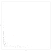
I have plotted x against y. I probably should have swapped round the letters I use, the primary measure here is the horizontal axis, x and the normalising factor is the vertical axis, y.Most maps here are presented such that colour = f(x, y), with x the principle measure and y the normalising factor. Both of these statements are true for mine.
In most cases y = population, and f(x, y) = x/y. Neither of these statements are true for mine.
My y is very conventional. My f(x, y) is not, but it is the best I could come up with given the data and I have not worked out a better. I think I could if I did some numerical maths, but I shall not.
Both x and y you will really notice, and totally assume that they would be related. You see that the values on the scale are the actual values (though after going through f(x, y) they have some very odd unit). It is log transformed because it is a very long tailed distribution.
Not allergies.
I have highlighted the highest, Equatorial Guinea, in red, the lowest, Tajikistan, in light blue. The United States and Haiti are both fairly close in f(x, y) but are pretty far away in this plot, they are both orange.
Attachments
Yes. Y is GDP per capita. This is the map of that (the reciprocal actually to get the colour right):Is one of the values GDP per capita (or a similar measure of wealth?)
So that leaves the main factor. This is the map of that:
You can see this is pretty much a map of development, so I thought the normalised one was better. The top and bottom countries:
Code:
> head(world_stats[order(world_stats$function_result),c("name","function_result","first_value","second_value","rank_x")], n = 10)
                name function_result first_value second_value rank_x
214       Tajikistan       0.7372186     0.00035     2106.339     29
28           Belarus       0.8117586     0.00005    16235.171    110
84            Greece       0.8617824     0.00003    28726.079    134
174           Poland       0.8708258     0.00004    21770.644    125
141        Macedonia       0.9084294     0.00008    11355.367     91
145       Montenegro       1.1227668     0.00008    14034.585    101
69           Finland       1.1954440     0.00003    39848.134    150
26  Bosnia and Herz.       1.2636445     0.00013     9720.342     82
136          Moldova       1.3296926     0.00034     3910.861     45
56        Czech Rep.       1.4176475     0.00005    28352.949    131
> tail(world_stats[order(world_stats$function_result),c("name","function_result","first_value","second_value","rank_x")], n = 10)
          name function_result first_value second_value rank_x
36    Botswana        22.53480     0.00169    13334.199     99
149 Mauritania        23.98173     0.00723     3316.975     42
202   Suriname        24.01807     0.00169    14211.878    102
25     Bahamas        24.83869     0.00085    29221.991    135
45       Congo        26.39849     0.00509     5186.345     57
154    Namibia        26.99010     0.00319     8460.847     77
2       Angola        33.08600     0.00561     5897.683     63
158    Nigeria        44.65188     0.00867     5150.159     56
75       Gabon        49.44563     0.00322    15355.785    105
83  Eq. Guinea       127.81156     0.00379    33723.366    142
Attachments
It is death by some means, but not hunger.Death by some means? By hunger?
- Status
- Not open for further replies.
Similar threads
- Replies
- 1K
- Views
- 56K
- Replies
- 1K
- Views
- 55K