My second foot unit: Esqueleto Diabo

Joined
Feb 7, 2004
Messages
3,641
Location
Campinas, Brazil
The file is: http://www.civfanatics.net/uploads9/EsqueletoDiabo.zip

This is my second unit using Poser, I hope I got better than Cave Man, that I did yesterday. I use some types that I received in Cave Man treat, thanks folks!
Esqueleto Diabo is a fantasy unit, it is a skeletor from hell :devil2:
I'm witing for more feedback, I think I can get some error in this one too, but I can't do mistakes with these cool Tupi units :D
SOUNDS QUESTIONS: what exactly line I have to type to use the soudns of the Swordsman??? I tried some commands and them did not work, the currently file does not have sounds effects yet.

Icon
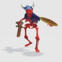
Esqueleto01.jpg


Attack
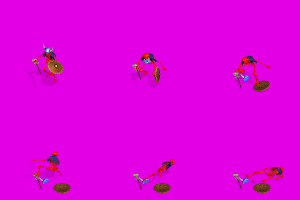
Esqueleto-Attack.gif


Death
Esqueleto-Death.gif


Fortify
Esqueleto-Fortify.gif


Default
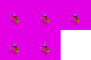
Esqueleto-Default.gif


Victory
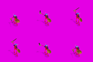
Esqueleto-Victory.gif


Run
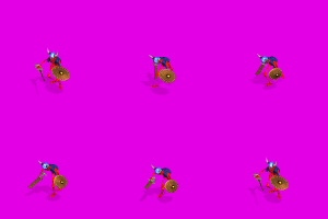
Esqueleto-Run.gif
 
definatley an improvement, looks hellish (in a good way :lol: ) :goodjob:

regarding sounds, say if you want to add the swordsman attack, you'd have to type in this -
..\swordsman\SwordmanAttackA.amb
basically just 2 dots to show it's in buried in some folders, then the folder name of the original unit, then the name of the audio (or .amb) file you want too play :)
Look at any of my units for more examples

EDIT: i forgot to mention one thing, for civ units (especially humanoid) the "thinner" features, such as arms an legs are exxagerated a bit, the reason is demonstrated very well in this skeleton because there are mysterious gaps in the bones, therefore, I'd enlarge "small" features that you want included in the future :)

EDIT2;): another suggestion, for the default, most (if not all) units barley move, I think I'd have a siezure after looking at this unit ingame for too long :crazyeye:
 
Dease said:
EDIT2;): another suggestion, for the default, most (if not all) units barley move, I think I'd have a siezure after looking at this unit ingame for too long :crazyeye:

I aggree 100% If you look at my Sweeper/Death machine, you can see that for the default animation, all it does is idle its engine (it bounces 2 degrees and puffs some smoke out its exhaust pipes ever so often). Good Unit though, What camera and camera settings do you use? Also, what's your lighting settings? I've been slowly gathering the props I need to make my Arashi Commandos, and might try them out once I get the GrossPanzer done, but I have no clue of how to use Poser to create units (the tutorial that Kinboat wrote was rather confusing... :crazyeye: )
 
Awesome! Now which undead could this be besides a skele. I'll have to do some research. Then it's going in the mod. :thumbsup:

P.S.-the preview is kind of blurred. Is that just the preview or is the unit too?

Too bad Blizzard would never allow a Diablo mod.
 
The unit is red and the background is pink, for this reason some animations could be confuse in this preview, but it does not happen in the game. The preview speedy is too quickly and the unit spin, I have to fix it in my next units previews.

Thanks for all the ellogies!!! And thnaks for the good tips, I'll use them :) The first that I'll try is the sounds tip.
 
There is too much movement in the Default
 
It's a neat-looking unit, but I think it'll need some changes to be more widely appreciated... a lighter, less red colouring for the bones would be more suitable, plus the aforementioned modification for the default graphic would be good. I think shorter legs but a bigger overall size would be a plus, but not crucial...
 
I think I can still see some of the larger gaps :sad:
also, it's not centered,
and the shadow should be slightly transparent.
size is good :D
maybe lighten it up a bit

sorry if I'm soundin picky but I'm just trying to help you :)
 
Dease said:
I think I can still see some of the larger gaps :sad:
also, it's not centered,
and the shadow should be slightly transparent.
size is good :D
maybe lighten it up a bit

sorry if I'm soundin picky but I'm just trying to help you :)

No problem friend, I like your suggestions and I know there are constructive! :goodjob: Let's see:
- I used the shadow color in Poser gray 115,115,115 (RBG), is it correct? what number I would use?
- I used the unit in that Kinboat Poser model, did I do something wrong? (cos the unit was not centered)
- When I say "gaps", what do mean? the space among the bones? the sizes of the Skeletor? This is a new word to me :blush:

thanks friend!!! also thanks for all the other suggestions, I really love them!!!
 
CivArmy s. 1994 said:
No problem friend, I like your suggestions and I know there are constructive! :goodjob: Let's see:
- I used the shadow color in Poser gray 115,115,115 (RBG), is it correct? what number I would use?
- I used the unit in that Kinboat Poser model, did I do something wrong? (cos the unit was not centered)
- When I say "gaps", what do mean? the space among the bones? the sizes of the Skeletor? This is a new word to me :blush:

thanks friend!!! also thanks for all the other suggestions, I really love them!!!
- hmm, I don't actually use a "colour" for my shadows, they're just there in openfx and you can change the intensity is you want them lighter/darker, if poser uses a set colour for shadows, then I'd say 174/0/174 would be ok.

- well, it prolly is something wrong with the setup (maybe the model isn't centered) but I'm not familiar with poser so I dunno the cause of the problem :( . HOWEVER it IS still possible to correct this using flicster, here are the steps -
1. open the .flc that flicster created (not the .fxm), and export it as 8 "multiple standard flcs"
2. wherever you exported them, a .ini should've been created, open it and edit the x/y coodinates to what you want, I find trial and error is the best way to learn, once you're a bit more experienced you'll have a "feel" for centering them(higher x = over left more, higher y = down more)
3. open flicster again, and open the .ini you just created, make sure the the file types thing is set to ALL files then say yes when it says something about merging files into one and now all you have to do is test it :)

- gaps, basically empty spaces between two objects. I'll admit, it looks much better ingame than in the previews :goodjob: however there are still a few "problem" areas. ones I notice right away are for the one with just 1hp facing NE there is a strange gap where his hip should be, another is in all the views where his sword crosses his legs, there seems to be a few pixels missing :confused:

also, I'd say add more colours in the future, they will make the units features clearer and will add variety :)

I wish someone had told me all of this when I started to create units, it would've made my life a whole lot easier, so I hope to see some really great units from you! :whipped: :p j/k
 
Back
Top Bottom