Ugliest buildings thread

Kyriakos

Creator
Joined
Oct 15, 2003
Messages
78,218
Location
The Dream
Due to the pro-brutalist lobby i decided to sacrifice the brutal attack on that style, at least in the title of the thread :)

Other than that the thread is about posting (and maybe discussing) buildings deemed honestly as very ugly.


Some highlights from the older thread:

-New Olympic games Tower, in London

arcelormittal_2159769k.jpg


-National Library of Kosovo

Kosovo%20national%20library%20in%20Pristina.jpg


And, of course:

-Practical Elephant-room house in Nigeria (which in my view is quite cool) :)

25tw2mq.jpg
 
Still disagree that that Olympic Tower building is "ugly"

Since I seem to be doing a lot of talking the talk with out any concomitant walking of the walk, and because I'm interested in this thread actually doing something interesting for a change, I'll give an example of what I mean by justifying the opinion from a formalist perspective.

dezeen_ArcelorMittal-Orbit-by-Anish-Kapoor-and-Cecil-Balmond_a.jpg


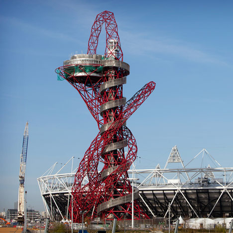
The building above is an absolutely brilliant piece of modernist architecture. It makes very interesting use of asymmetrical, almost random use of line to create interesting shape and geometry to an unconventional building. The use of thin, red lines in the support structure creates a buzzing, flurried jumbled vortex shooting vertically, while an enveloping iron ring around the outside contains the red mass inside giving the piece balance and stability. The theme is continued as the form leans to the left, extending out to hold the actual building proper as the red mass of lines tapers off leaving a more orderly and elegant ring of red to hold the sleek, modern looking cylindrical room.

The color of the structure is particularly interesting. The red dominates the lower parts of the structure and are what the eye immediately sees, but the red is not overwhelming as the cooler silvers and blue-greens of the rest of the structure mute the red, somewhat. The color is in your face, but it doesn't overwhelm you completely.

Contextually the tower serves as a brilliant contrast to the neighboring Olympic Stadium. The stadium employs simple tressing and basic, symmetrical, repeated patters in its bars for the orderly, and no-nonsense practical structure. Standing next to it the messy, seemingly random and asymmetrical tower stands out immediately and the red of the tower played of the bright white of the stadium's background results in the tower moving immediately to the foreground of the viewers eye. At the same time, however, the use in the tower of the tress motifs ensures that the tower synergizes well with the stadium; they feel like they belong together.

Overall the tower is a powerful and eye-catching piece. The asymmetrical shape and bright colors of the support frame are unique and immediately recognizable. At the same time a sober, restrained use of sharp, strong silver spiral staircase keeps the work composed and under control. The actual room of the structure, seemingly placed precariously away from the vortex is almost calming, above the mess of struts below it, and the overall form of the room feels like something out of a sci-fi novel. Ultimately the piece is part of a larger compilation built for the Olympic Village as a whole, and while the tower is a brilliant piece of gaudy brutalism, it still retains the motifs and styles of its environs, resulting in a building which is eye-catching and forward looking, but not so much so that it feels out of place.


Now is something like that really too much to ask?
 
I usually agree with you Owen, but this time I agree with Kyriakos, that building look quite messy, there are other good postmodern asymmetrical building take for example capital gate tower Abu Dhabi. However in the end, beauty is something quite relative and hard to argue.
 
I usually agree with you Owen, but this time I agree with Kyriakos, that building look quite messy, there are other good postmodern asymmetrical building take for example capital gate tower Abu Dhabi. However in the end, beauty is something quite relative and hard to argue.

Sometimes a building just looks good to all, though. And since we now have Tolni, here is that famous Sofia outremer renting-apartment building:

snail-house.jpg
 
mmmm that snile like building might look cute though, but I doubt everybody will say it is beautiful. But I agree with you, beauty seem posses both of relative and absolute form, some beauty are relative some are agreeable to all. Just like truth. And I know many will not agree with me especially those who see all of it just a mere social consensus.
 
I'd place my university campus in this thread, but the thread forbids brutalist architecture. :)
 
It doesn't forbid it, of course ;)
Merely does not promote brutalism as the standard choice of building design to be posted.

Edit: changed that bit of the title so as to make it clearer :D
 
I think that whoever lives in that building is likely turning to a serial killer :O

:lol: that building surely look like the knife that usually own by butchers.
 
Ok, don't tell me I didn't warn you.

Spoiler :
VU-campus-02.jpg


The building rightfully unprominently displayed on the right is actually the main building. The building with the white dome and the red stuff on it is the Maths and Physics building where I have the bulk of my lectures. That one looks okayish on this picture though when viewed from the front it is pretty ugly as well.
 
Building that intent to resemble elephant in Thailand, I don't know if it is end up to be ugly or cute, it is really depend on how you see it:

3CAFD1510.jpg
 
Ok, don't tell me I didn't warn you.

Spoiler :
VU-campus-02.jpg


The building rightfully unprominently displayed on the right is actually the main building. The building with the white dome and the red stuff on it is the Maths and Physics building where I have the bulk of my lectures. That one looks okayish on this picture though when viewed from the front it is pretty ugly as well.

I was going to say, the one on the right is pretty stale and bland, while the red one I find quite pretty.
 
Ok, don't tell me I didn't warn you.

Spoiler :
VU-campus-02.jpg


The building rightfully unprominently displayed on the right is actually the main building. The building with the white dome and the red stuff on it is the Maths and Physics building where I have the bulk of my lectures. That one looks okayish on this picture though when viewed from the front it is pretty ugly as well.

I don't find that too bad, though the dome looks kind of out of place in my opinion and overall a bit disorganized.
 
Due to the pro-brutalist lobby i decided to sacrifice the brutal attack on that style, at least in the title of the thread :)
I maintain that brutalism is flagrant false advertisement. I'd have no problem with it if it was actually brutal architecture. Like such:
Spoiler :
3760971-0259204992-Mordh.jpg
 
For being absurdly boring for their height, it's hard to beat the old World Trade Center. Fortunately a plucky little demolition crew headed by a guy with a graduate degree in urban planning took it upon themselves to remove the towers, which were replaced by a somewhat better building.
 
Back
Top Bottom