Altered maps IZ: gib clay!

Status
Not open for further replies.
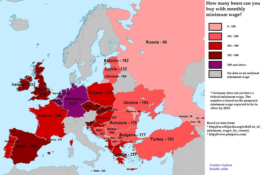
There's some weirdness in this map, at least relating to Spain. It seems to account for some of the projected reactors whose construction was stopped in 1984 and also for some reactors which were long ago dismantled, but it also ignores at least one active reactor.

It's map from 2005, I didn't noticed that before , maybe I should find more accurate ?
 
map doesn't line up with the UFO visits, no visits in southern france, too many in uk, no rector in moscow/kaluga/ireland/istanbul
 
How do you know about the UFO visits?
 
There's a light hovering outside my window so now I stand corre
 
Aliens visit the UK regularly, the Tripods won't take long to surface.

as-graphic-aliens.jpg
 
Please. Brexit is actually a sound strategy. With no imports there will be no need for pepper pots in people's homes, thereby depriving Daleks of any natural camouflage. That, coupled with a return to 19th-century staircase-centred homebuilding, shall thwart their invasion.
 
Monstruous
 
The original charters of the Connecticut colony (and others I forget) stated that their borders stretched literally until the opposite coastline. That would mean Connecticut should include parts of Ohio, Illinois, Missouri, Nebraska, Wyoming, Utah, Nevada, and California. Texas and Idaho have accomplished what Connecticut was once set to do. Good job, states!
 
Gosh, I found it quite boring.
 
It keeps resetting to the lowest resolution possible, therefore rendering itself illegible. :(
 
Does this say more about the general income or more about the price of beer?
While the richest countries can afford more, they also seem to be the beer drinker nations (except Spain, which is not a beer country, and Czech/Slovakia, which are not on the top income-wise, but are beer nations). And the poorer countries, which can afford less, are more the hard booze nations which probably don't produce as much.

tl;dr: I think besides the obvious meaning, I think there are hidden correlations in the graph.

Beers dirt cheap in Russia, wages are complete garbage.
 
Status
Not open for further replies.
Back
Top Bottom