Huayna Capac357
Deity
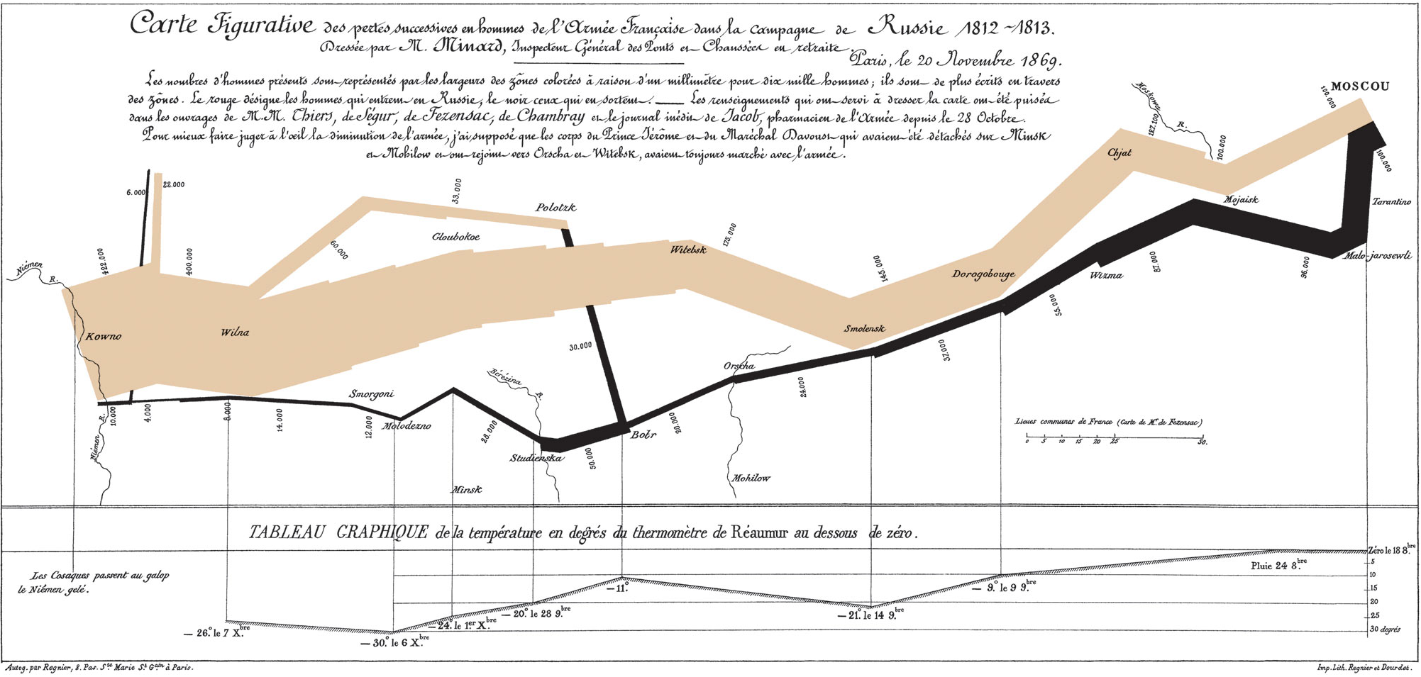
Darned Belarus, ruining Europe's 100% record.


Just for the record, it's "Low Countries". "Lowlands" is a more generic term referring to an area of low-lying country, used in contrast to a nearby area of elevated "Highland" terrain, e.g. the Scottish Highlands and Lowlands.What's up with the random province in the Lowlands?
As with most of Minards works, this map relates the thickness of each export line to the amount of coal it represents. Here, each millimeter of thickness represents 20,000 tons of coal. The numbers written over or beside the lines represent the total number of tons of coal, in thousands.

The major uses of British coal, according to the chart, are: the production of iron (Fer) and cast iron (Fonte), gas lighting (Eclairage au gas), steam engines in ships and trains (Navires a Vapeur et Chemins de Fer), and domestic fireplaces (Foyers Domestiques). A large amount of this production was also specifically slated for use in London, showing how that city was the major center of British industry.

The map above is a curious comparative map of the quantities of cotton and wool imported to Europe in 1858 and 1861. Blue represents cotton and wool from the United States, the orange from British territories in South Asia, and brown from the Levant (the East Mediterranean). Pink represents cotton and wool imported to Britain that was subsequently re-exported to Europe. There is also a small sliver of imports from Brazil, also in a light blue, though the original color may have faded. One millimeter represents 5,000 tons of cotton or wool. Click here or on the picture above to see the map enlarged.


Minard plots land transport via railroads in pink, and river transport via boat in green. Yellow lines represent overseas exports. Minard drew each line to represent 100,000 tons for each 33 millimeters of thickness. Click here or on the picture above to see an enlarged version of the map.


Spoiler :
Countries where the death penalty is used;
Blue is abolished for all crimes.
Yellow is abolished for all crimes except special circumstances.
Orange is retains but has not been used for at least 10 years.
Red is retains it.

 , but make that all of Scandinavia 1099-1600!
 Switzerland in 1943!

