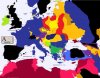
This is a map I've made a long, long time ago. It shows the stability of regimes in Europe. Black is unchanged possession of the land by a country from the start of XX century. Blue is the same, but with temporal occupation by a foreign country.
Greens if I remember are changes prior to ww1. Purple are reversed changes.
Bright yellow (Poland, Czech Republic) are areas that were in theory the same before ww1 and after it, but not in reality.
Yellow are ww1 changes.
Brownish (Belarus) are interwar changes.
Red are ww2 changes.
the Arab countries have their own scale, I don't remember why and what it was supposed to mean.
I think it shows nicely where to expect stability and instability.